The Design Blog
Here I’ll discuss the stories and techniques behind my work
recent Posts

The Small Three
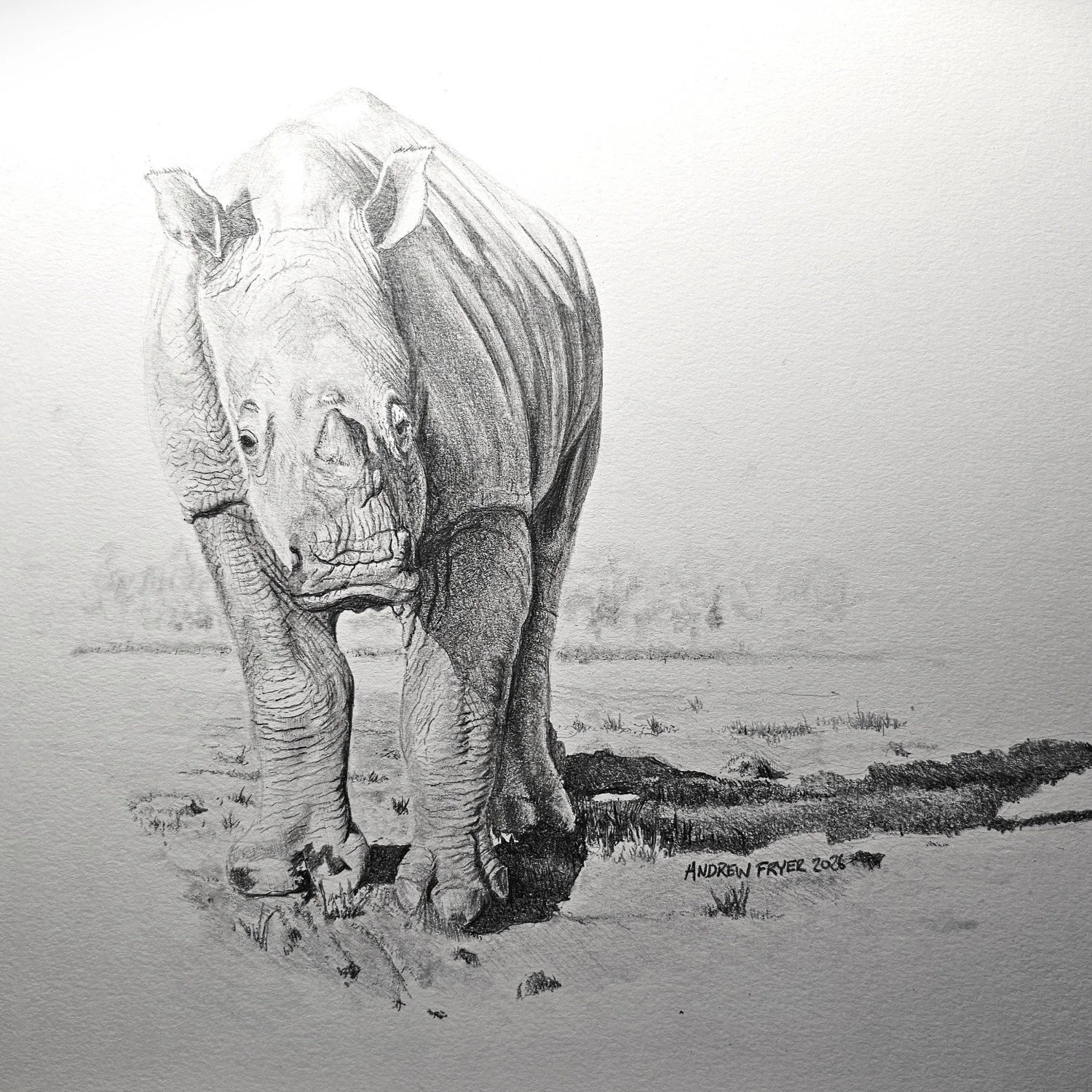
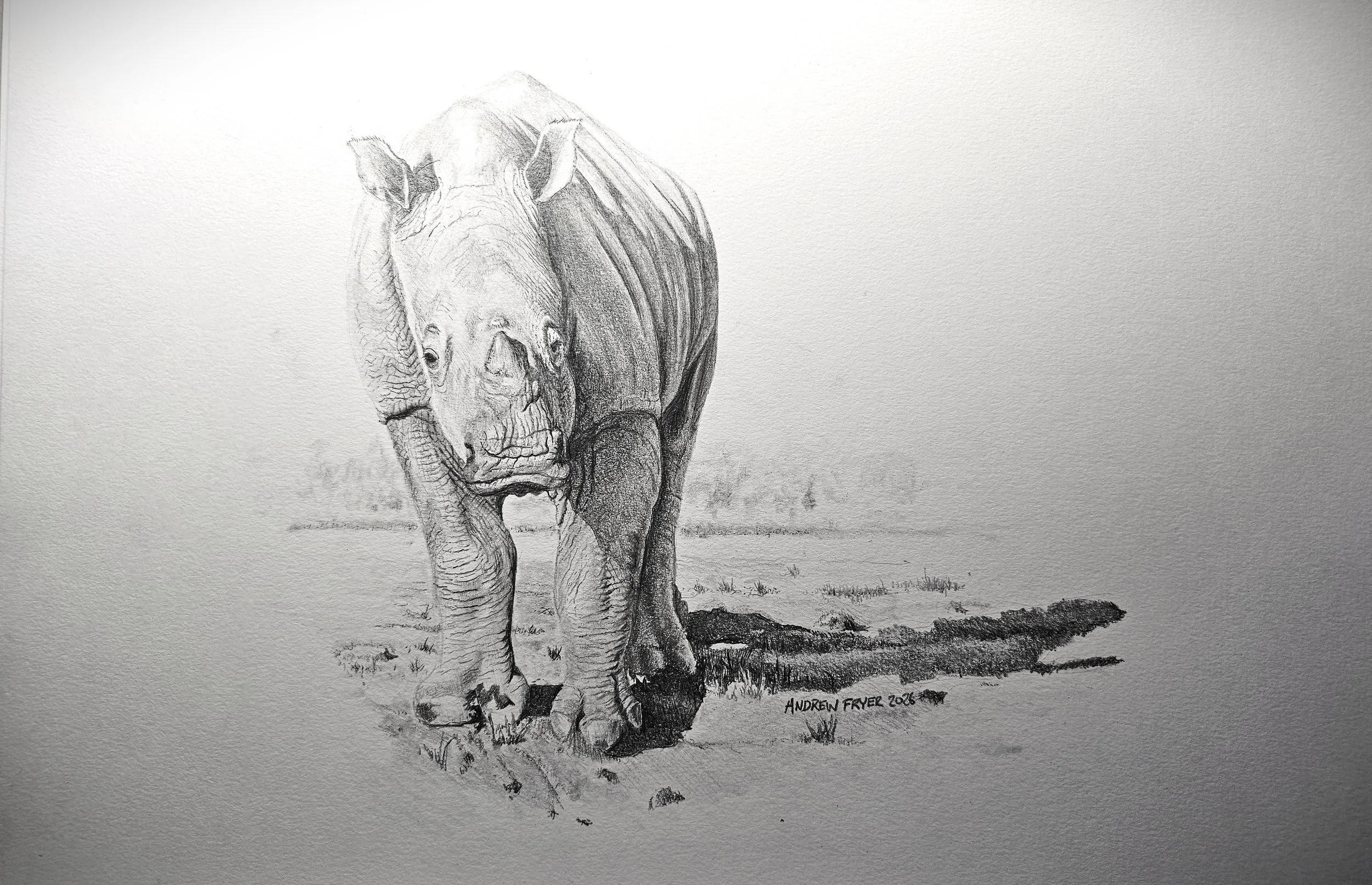
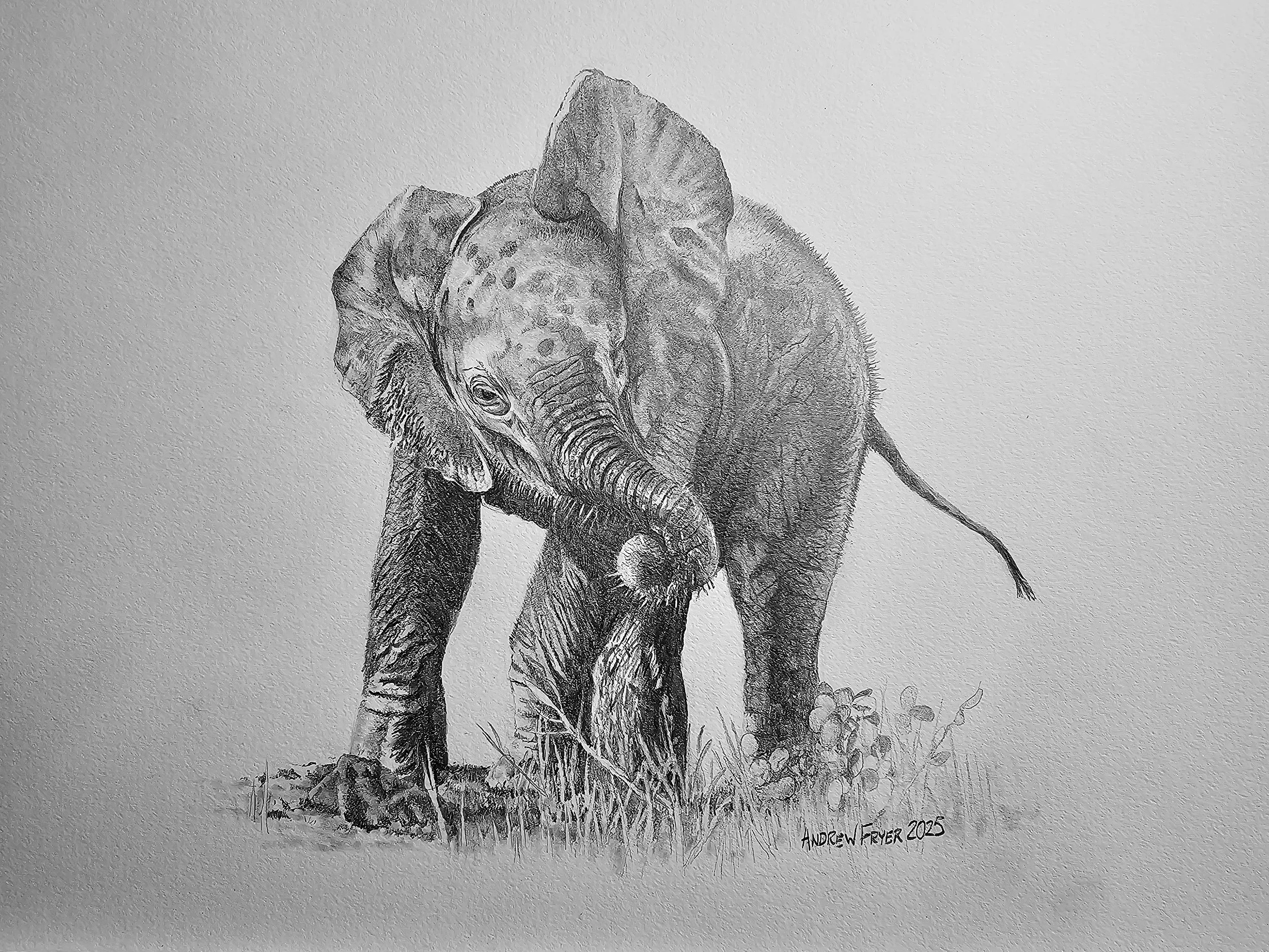
Three pencil studies of iconic babies we saw on recent safaris
Every time we go on safari you hear mention of the big five, supposedly the most dangerous animals to track and hunt on foot in Africa. Despite the fact that most safari tours are done by Landcruiser you still get interest in seeing them all and many tourists are happy with a snap of each on their phones. We like to spend longer and the animals we watch and photograph are the ones that are interacting. We have ben lucky enough to get really close and often we are the only ones there.
Now we are back at home I like to remember those encounters by drawing and I wanted to do some series on the juveniles and babies we have seen as they are fun to watch/
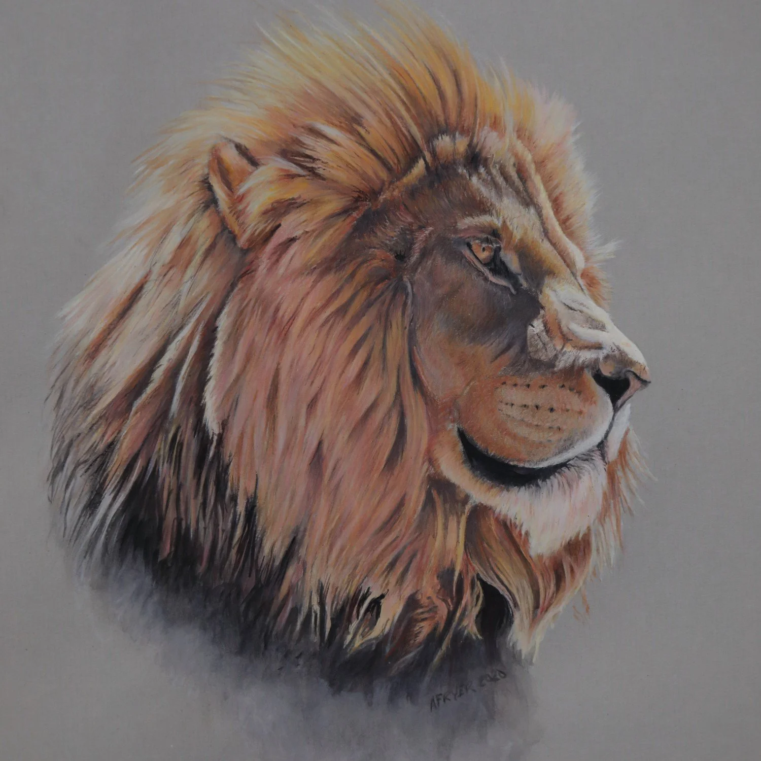
First there was a family of White Rhinos we saw in Namibia , this was very special as we got to help feed them as the rangers wanted to encourage them to move away form the boundary of the park to make it harder for poachers to attack them. Poaching is a serious concern and the team were armed not to protect us but to defend these magnificent animals from harm.
I have done each of these in grpahit pencil as they are not that colourful and the black and white treatment emphasises the textures and tone.
A baby White Rhinoceros still a little unsteady on his feet
We also went to the Chobe river between Namibia and Botswana. We saw large herds of elephant reminiscent of a Sunday picnic where families would come and say hi and the young would play with each other. This lillte chap has had his afternoon bathe to cool down and like any sensible child he’s applying sun block (aka mud) to protect his skin..
mud mud glorious mud - you can see all the splashes on him and how he’s drying out.
Finally there’s the most dangerous animal for humans in Africa the Hippopotamus. This was taken by Juliet of a hilarious half an hour where the little lad is playfighting with dad even though he hasn’t got his tusks yet. After doing that he decided he wanted a piggy back ride while dad quitly puts upwith all this unwanted attention.
I am the king of the castle
I am pleased with the result, I think the rhino is the weakest of the three perhaps I need darker shadows to create more punch like the other two?
The Bad Workman
How I have started to use more professional materials to improve my work and get the look I want first time
A bad workmen blames his tools. In my case I just put my inability to get the result I want down to my lack of ability. However I recently went to a local art club and the tutor who runs it was able to help me with a couple of things. Firstly to have a good palette top mix on, I have been using any old base of single use food packaging and when its gets too dirty I fling it. However it’s hard to see the colour you’re mixing accurately and it turns out a light grey sheet of glass is a better solution and having tried it I am convinced.
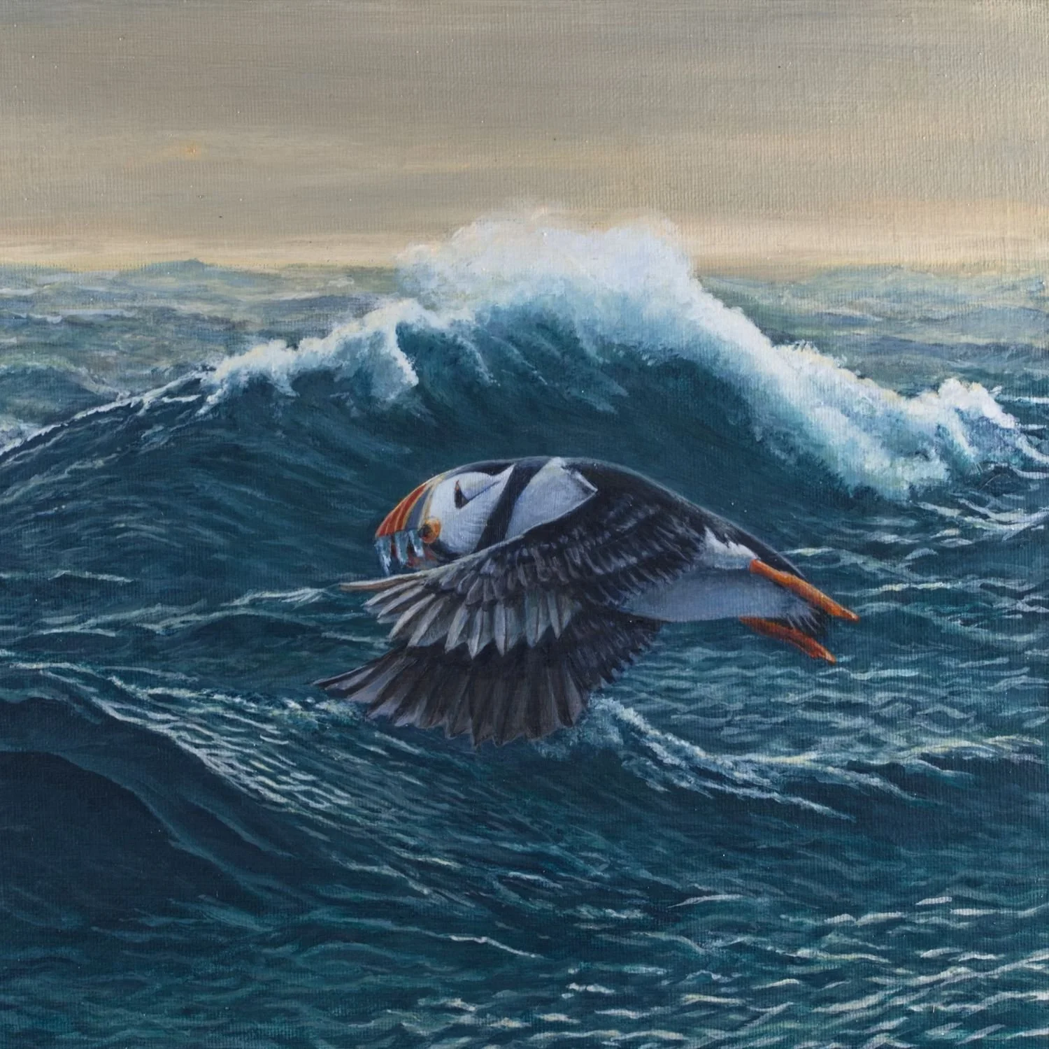
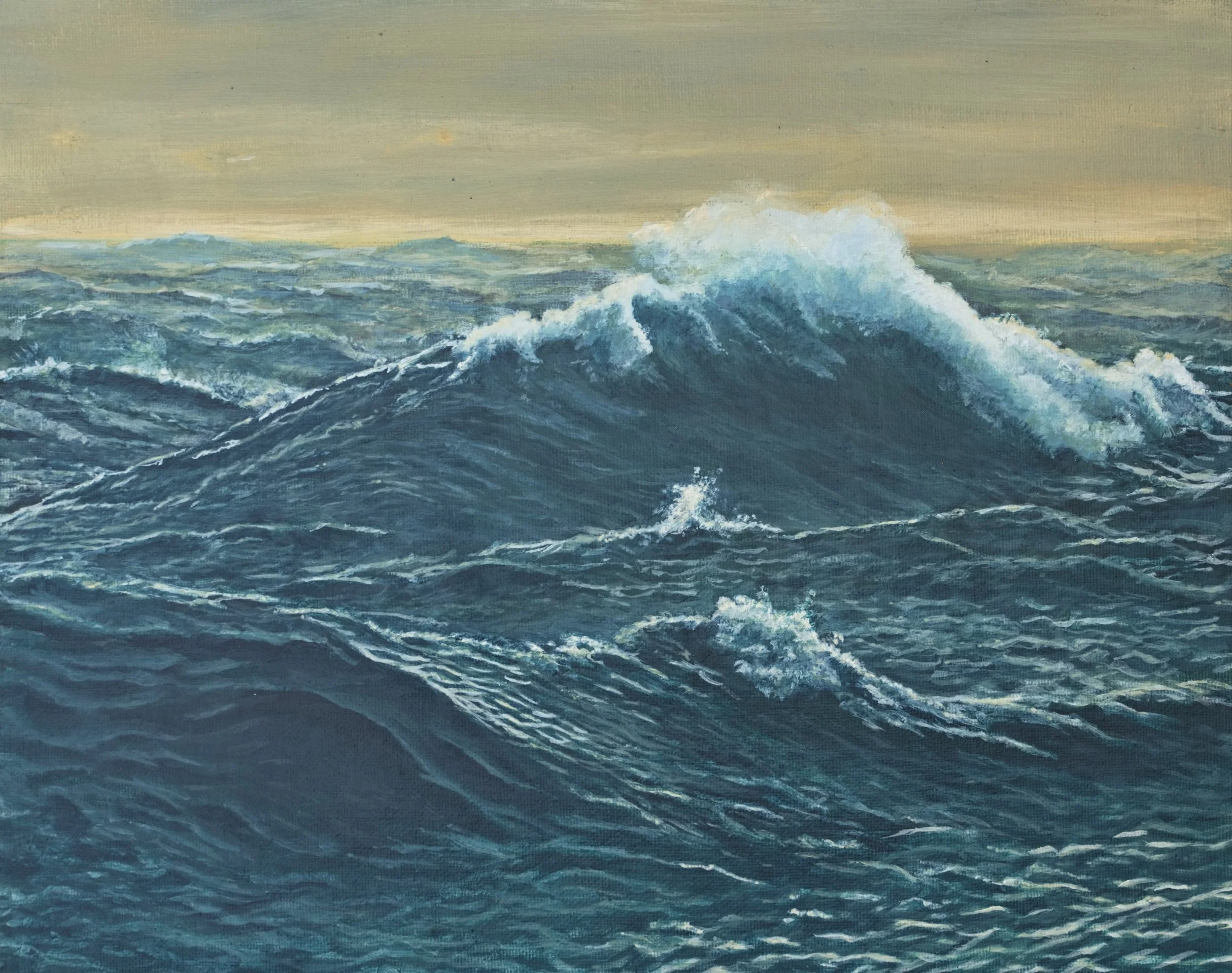
A much bigger problem was that in the past I’d use whatever paints from hobby shops. These cheaper paints change shade and colour when they dry, much like the emulsion we decorate our houses with. This is because the PVA body of the paint is white when wet but dries clear. Not only that, but cheap paints dry really quickly and while that’s great for some artists I prefer to be able to blend and mix colour on the canvas. So I have now invested in better quality paintsfrom US company Golden specifically their slow drying range Golden Open. My first real go with all this new stuff is this year’s Christmas card, a puffin.
For this work I wanted a stormy Atlantic seascape to highlight the determination of these little birds to survive and feed their young. This is only my second go at painting the sea and to be honest I was not really happy with my first attempt, so would the new paint and tools make a difference?
I did find it much easier to get the effect I wanted and was able to mix a batch of colour which remained wet almost like oil paints, even staying workable over night. Blending tones on the canvas is also easier, for example I was able to quickly get ȧ moody sky and then create seascape that I felt was a good picture in itself so I painted the whole scene.
Nuffin
I was pleasantly surprised that I got the look and drama I wanted and for some reason this image doesn’t look as good as the real thing. Anyway it was now time to turn the “nuffin” painting into a puffin painting.
The photos I used were from a trip Juliet and I made to the Farne islands between Newcastle and Berwick on the North East cost of England. There are thousands of these odd looking members of the auk family nesting on a National Trust owned islands. We were able to land on one of these and watch them weave their way past a gauntlet of gangster like gulls, beaks full of fish for their pufflings. Puffins have special hooks in their beaks that enable them to fly with a mouthful of sand eels as they return to their burrows. It was great fun to watch their aerobatic displays and we got great photos
Final Approach
I used one of Juliet’s shots where the puffing was skimming the waves with its catch and then adjusted the direction of the lighting and tone to make it look right against my seascape. I hope you like the result and have a Happy Christmas
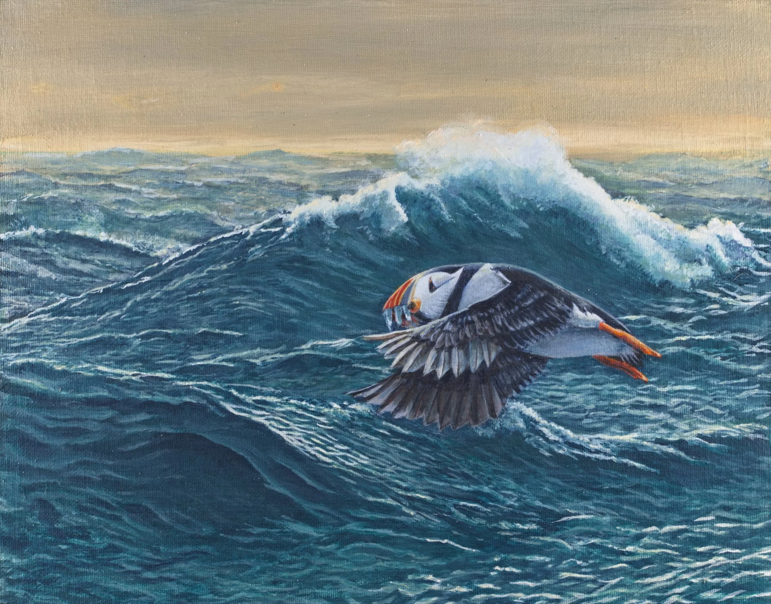
Puffin
Make someone happy
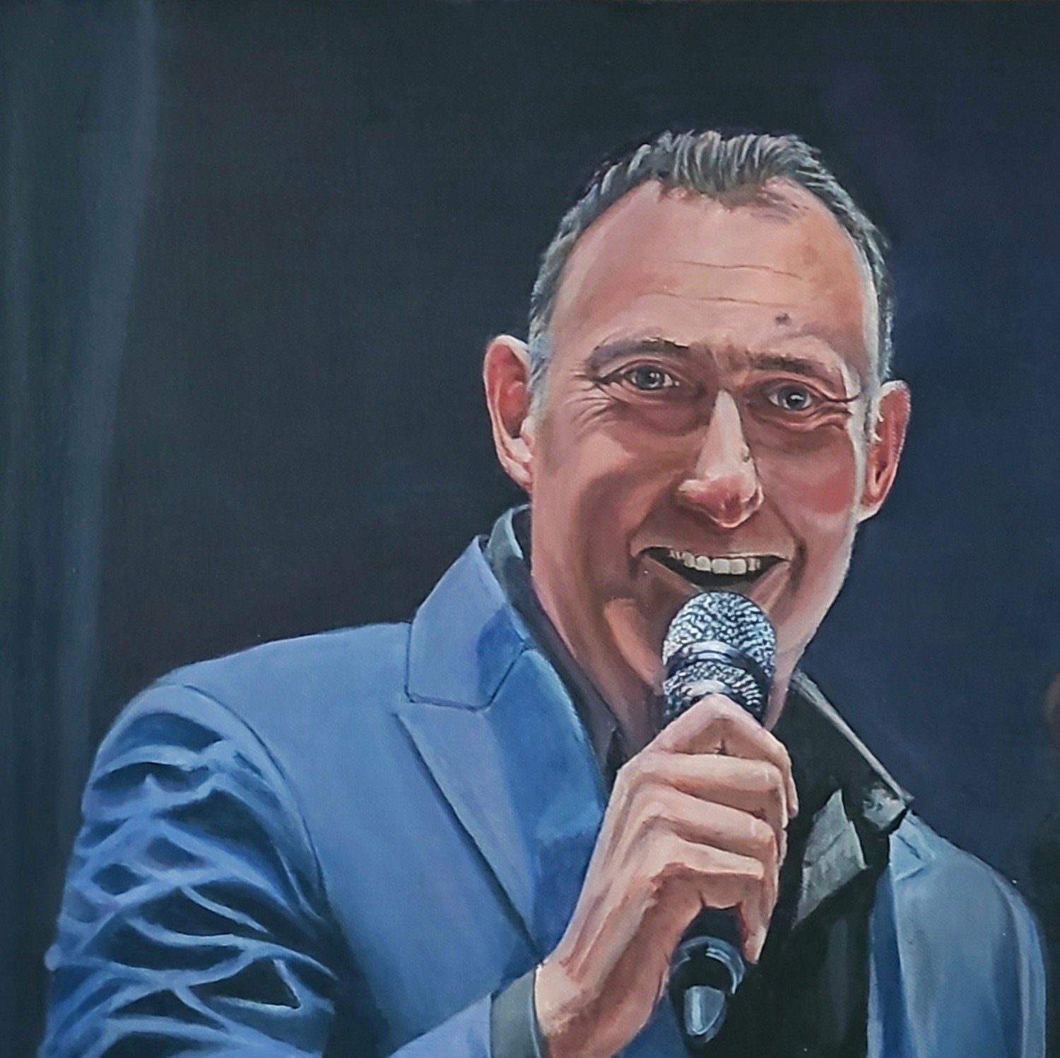
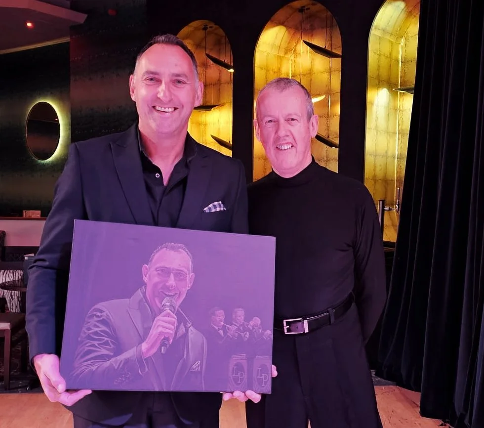
A portrait of Matt Ford probably one of the best big band singers in the UK. I also sketched Sarah Lambert a very talented pianist at the same LP Swing Orchestra dance break
When I am not painting I like to take my wife dancing but as we aren’t celebrities or professionals you won’t see us on that show on TV. We do take it seriously and there’s nothing better than dancing in front of a live band, and arguably the best in the UK right now is the LP Swing Orchestra. They play at the top venues and for the professional championships at Blackpool and fortunately for us at some of the Warners resorts around the UK. Its a great sound and fronted by great singers including my favourite Matt Ford. “Make Someone Happy” originally sung by Jimkmy Durante in 1964 is one of Matt’s sandards - you really feel he means when he sings and so I thought I would also try and make someone happy too. I can’t sing but I am OK with a paint brush and after a hard weeks work I think I captured him pretty well.
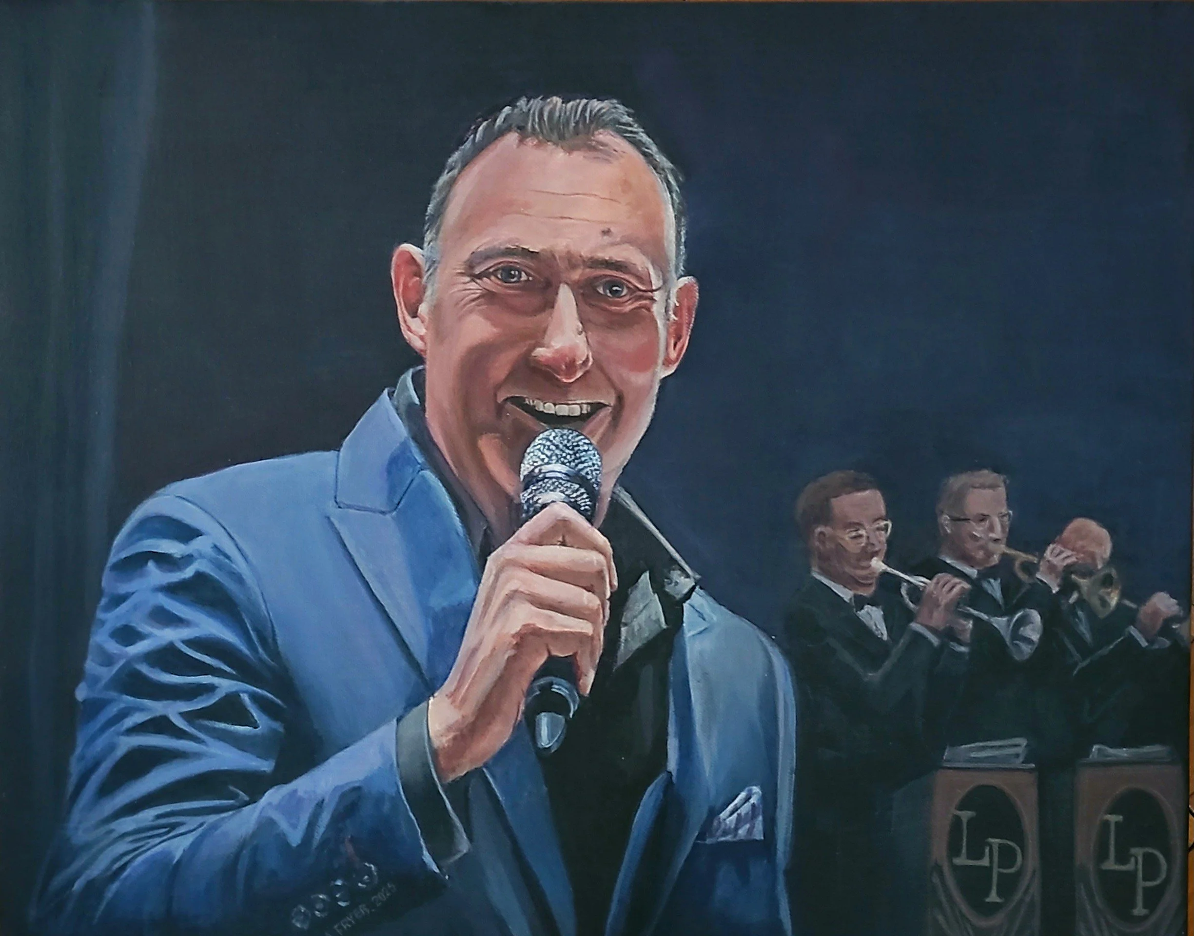
Matt Ford
I also did some sketching while on this break and that is more of a challenge, for three reasons it pretty dark in the audience musicians and singers are always moving when playing, and you maybe have half an hour, hour to make a study. This is Sandra Lambert the orchestras pianist and like many in LPSO she has a very successful career in her own right..
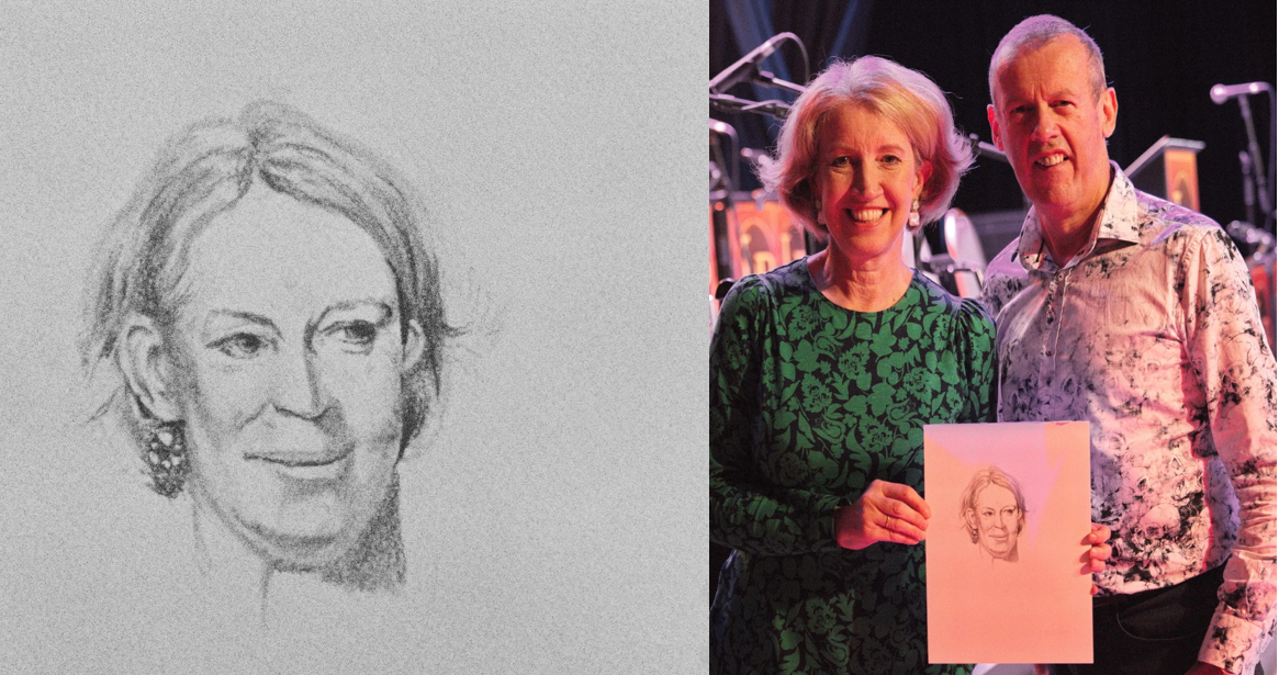
I found this very hard to do but Sandra liked the result and that’s what matters. So whatever your creative talent is “Make Someone Happy”
Photoshop with a Paintbrush
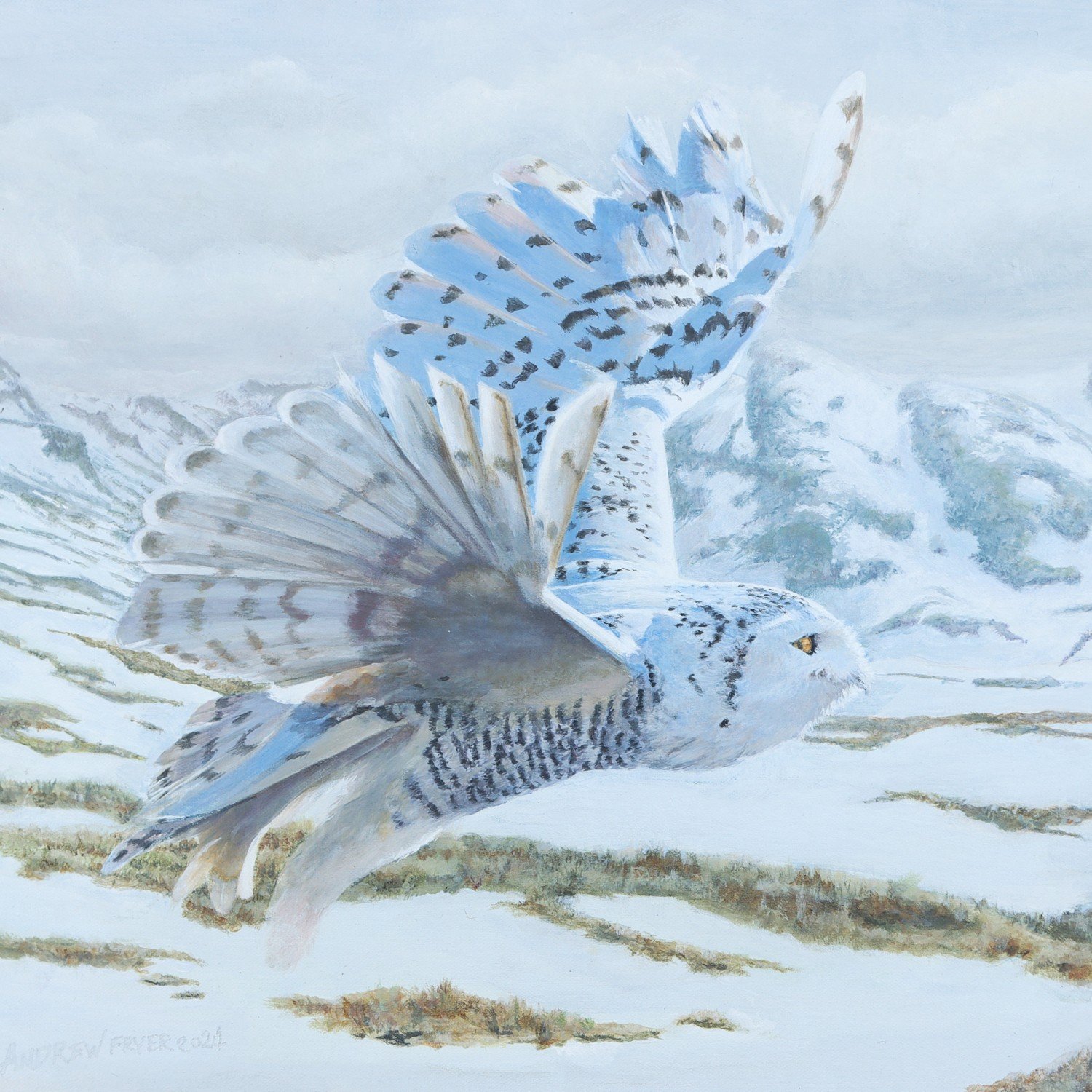
I am not a fan of photo-editing beyond basic correction - I’d rather create a new image with a paintbrush. Here Sweeney Todd a snowy owl from Andover is now flying over Flam in Norway, like his relatives might to for real.
I have a lot of friends who make extensive use of photoshop to alter their images, I don’t blame or criticise them for this but you do see so many altered images now that is impossible to see what is real and what isn’t/ My approach is different my photographs remain largely as is except to lift shadow adjust contrast crop etc. what I don’t do is use tool to manipulate images I have a paint brush for that!
So for this years Christmas card I used a picture of a snowy owl specifically Sweeney Todd, one of many amazing raptors at the Hawk Conservancy Trust in Andover. However I imagined her flying over her native habitat not the lovely rolling hills of the Test valley. So I dug out some shots of Flam in Norway to provide the right sort of background and a moody sky over my background to finish the job
So my painting is a complete work of fiction but surely that’s the point.
The other thing that makes this look realistic is that I limited my pallette and use the same range for the arctic landscape as for the owl- after all nature has evolved her to blend in to the landsacpe and not be seen!
I am often complimented about how my subjects seem to pop off the page and I think this is down to subtle visual clues. I try and and soften the background so less contrast and gentle transition between tones like the rock and grass. I increase the effect for the most distant parts of the painting like the horizon and use less colour to simulate the way the atmosphere reduces red and colour as distance increases. You’ll also see Sweeny Todd is flying in sunshine where the range behind her is getting increasingly grey and stormy.

Sweeney Todd over Flam
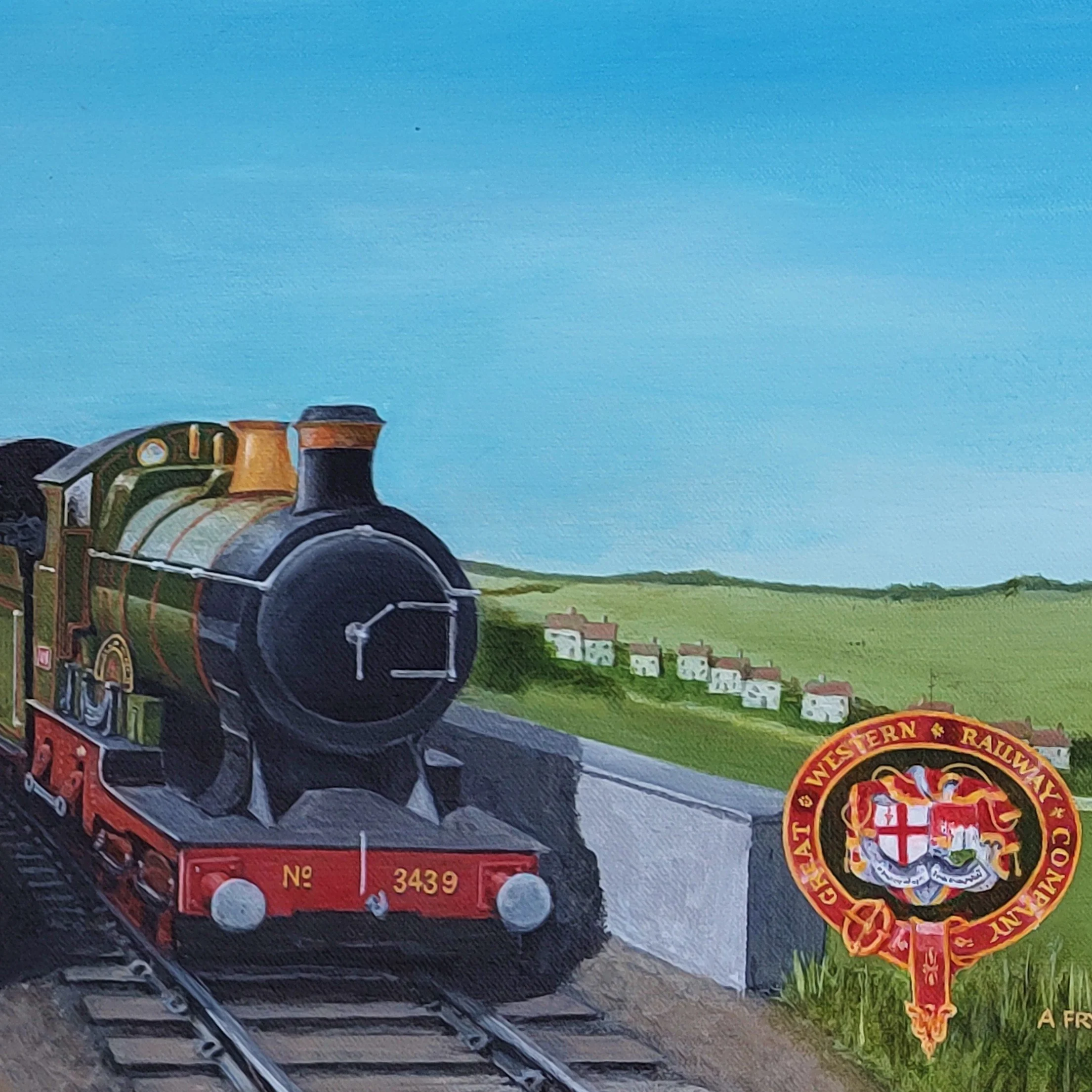
The Big Four
Four famous Locomotives form the interwar years done as an homage to the travel poster of that era. These are just for me to sit above the train layout in my loft
I probably have too many hobbies and one of them is that I have a model railway in my loft. Above the scenery I have a lot of space except on the north wall where the Velux windows are. To break up the big expanses I had the idea to add some posters of the train I have one for each of the railway regions that were formed in 1923 until 1947 known as the big four - LMS, LNER SR and GWR. I couldn’t find what I was looking for to buy and then I saw some very long thin canvases (100x 30cm) in Hobbycraft and decided to do my own posters based on the trains I run on my layout.
These trains were iconic in their time and were widely celebrated. They were also pretty quick even by todays standards and were the pride of the companies that owned them and the crews that operated them.
I started with the Coronation Scot and this is essentially copy of a painting by Norman Wilkinson, except I have used the maroon and gold version of the train as I have this a model of this loco and you saw the real thing at the National Rail Museum in York.

Coronation Scott at Shapps Summit
This took a very long time and much repainting to get right, never mind getting that fine gold lining and lettering to a good standard.
I then decided to tackle the Golden Arrow. Here I worked form photographs but again replaced the locomotive with one I have pulling this iconic train. The Pullman cars are still the height of luxury and you can still travel on special trains and experience what it was like to travel first class in the 1930’s.
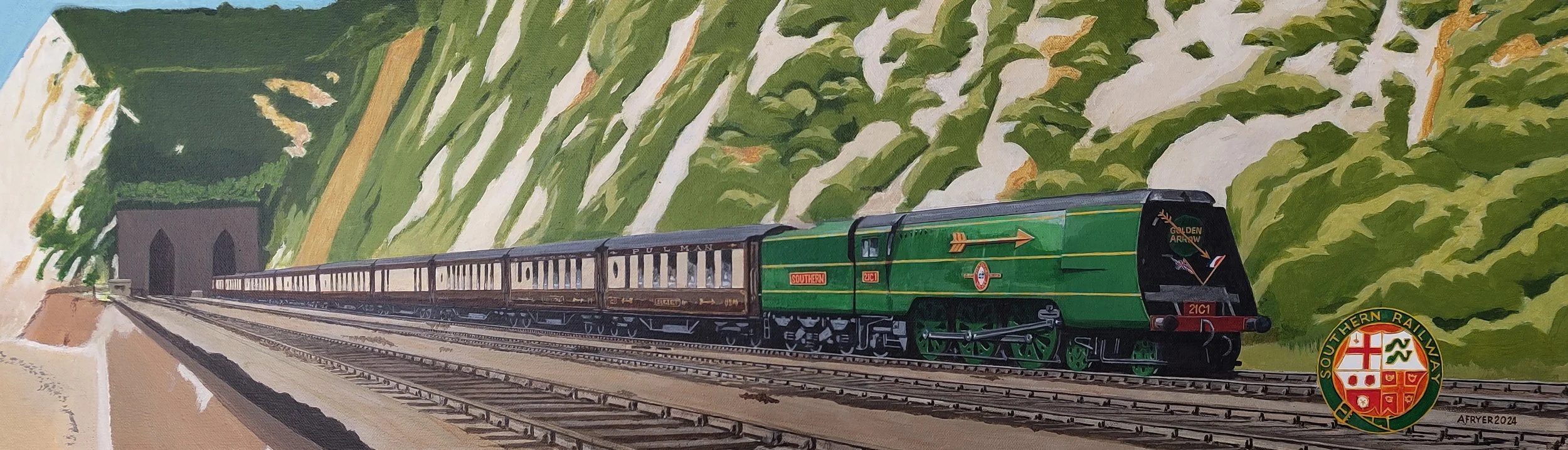
I have tried to use a similar composition, style and palette of colours to be consistent. Here the challenge was the exposed tracks and getting the perspective right for the unusual shape of this canvas.
Next up one of the most famous trains - Mallard, holder of the steam world record. I have shown her here pulling the coronation train designed for when George VI took the throne and it’s passing Alnwick, North of Newcastle.

The proportions need careful attention as many of my friends are railway enthusiasts and I did not want to disappoint them.
For my last painting I chose an older loco, the GWR City of London which would take passengers to Cornwall out of Paddington Station and pass over the iconic Brunel designed Royal Albert Bridge. Even in 1902 when this train was running this class could reach 100mph but GWR did not adopt the streamlined look for its locos like the other three railway companies so this does look more Edwardian than space aged. Locomotives like this also pulled ambulance trains that evacuated 1.2 million soldiers in World War One and that is the story I wanted to tell with this picture

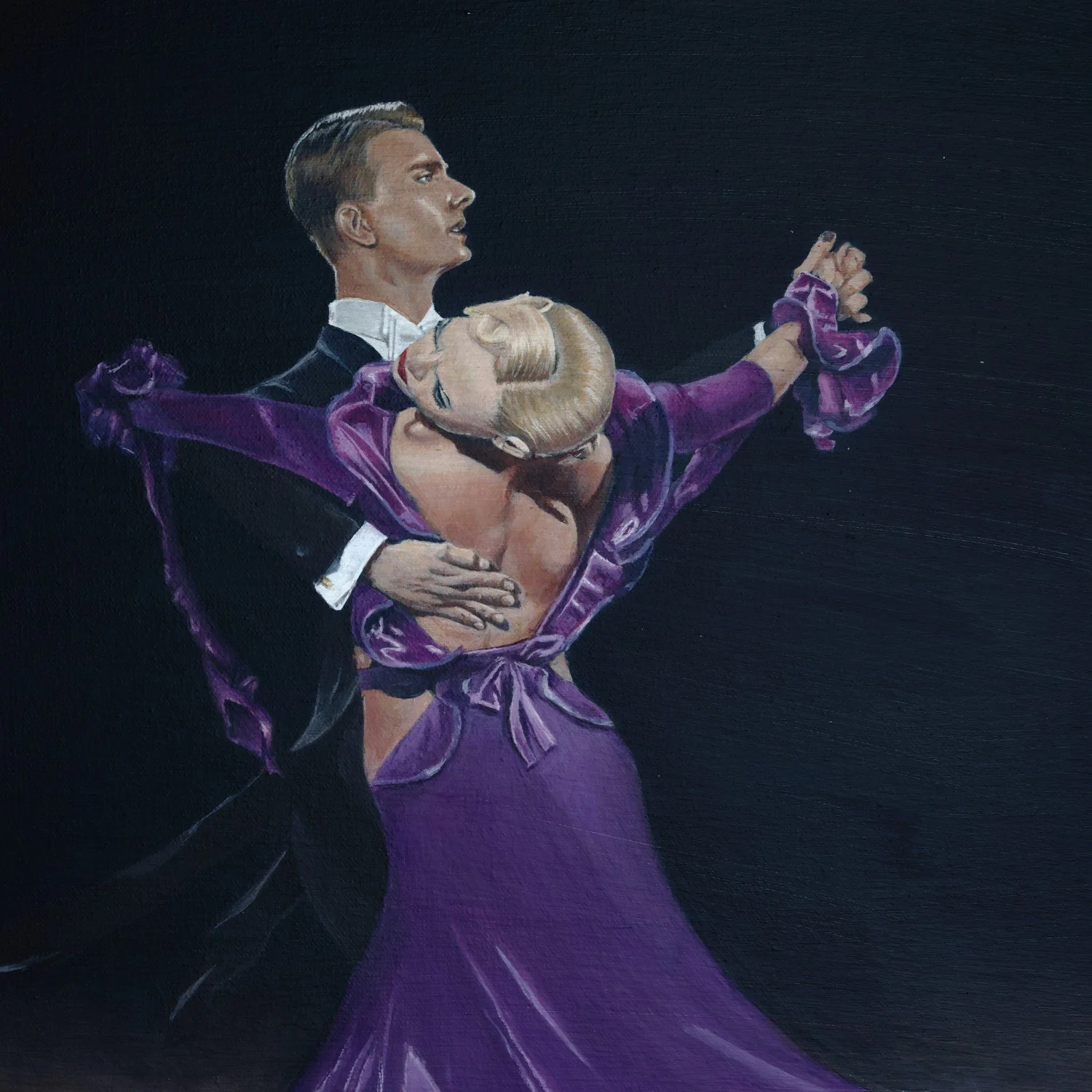
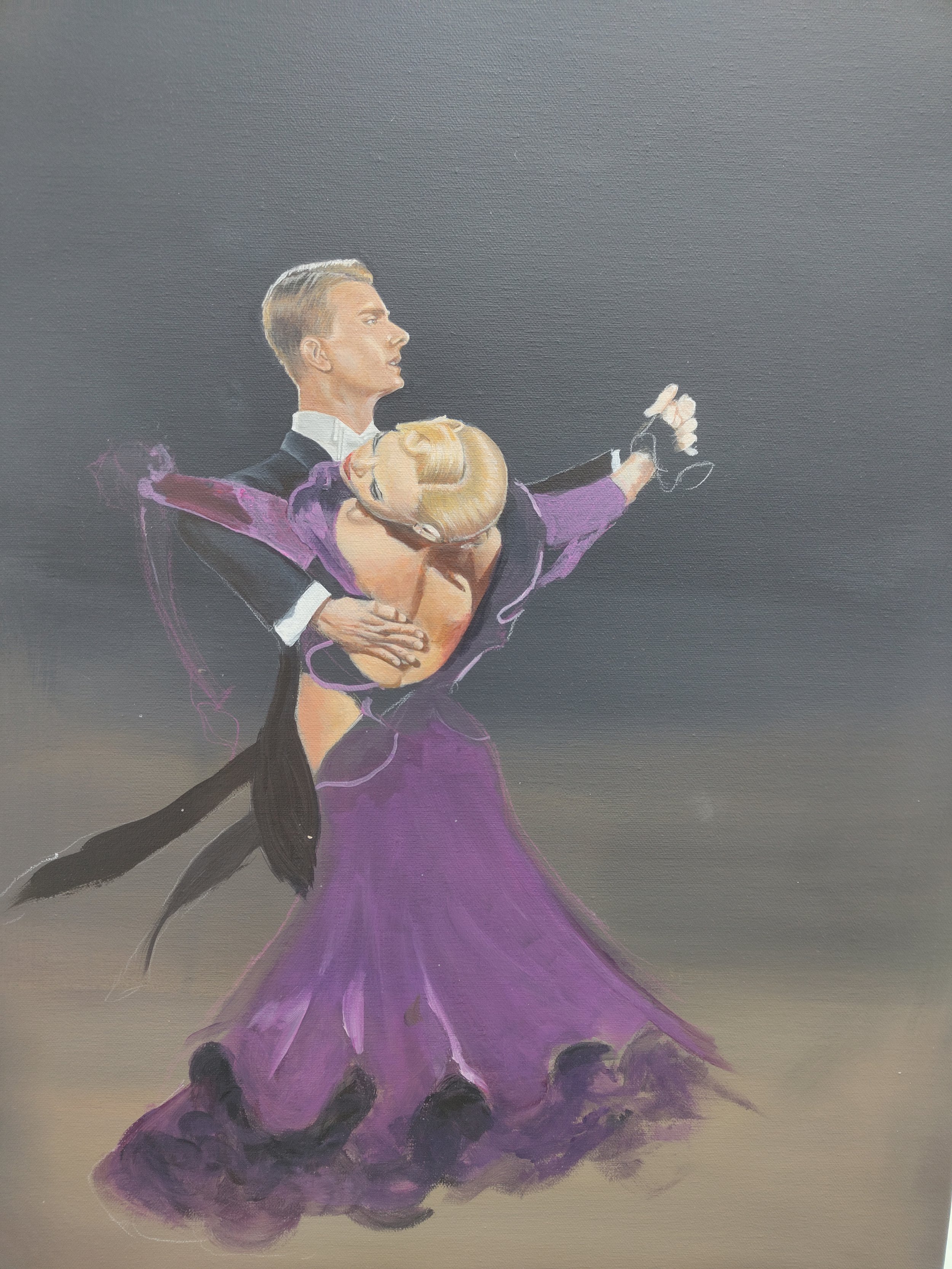
Freedom to Dance
A special Christmas present for our dancing friends Jane & Trevor
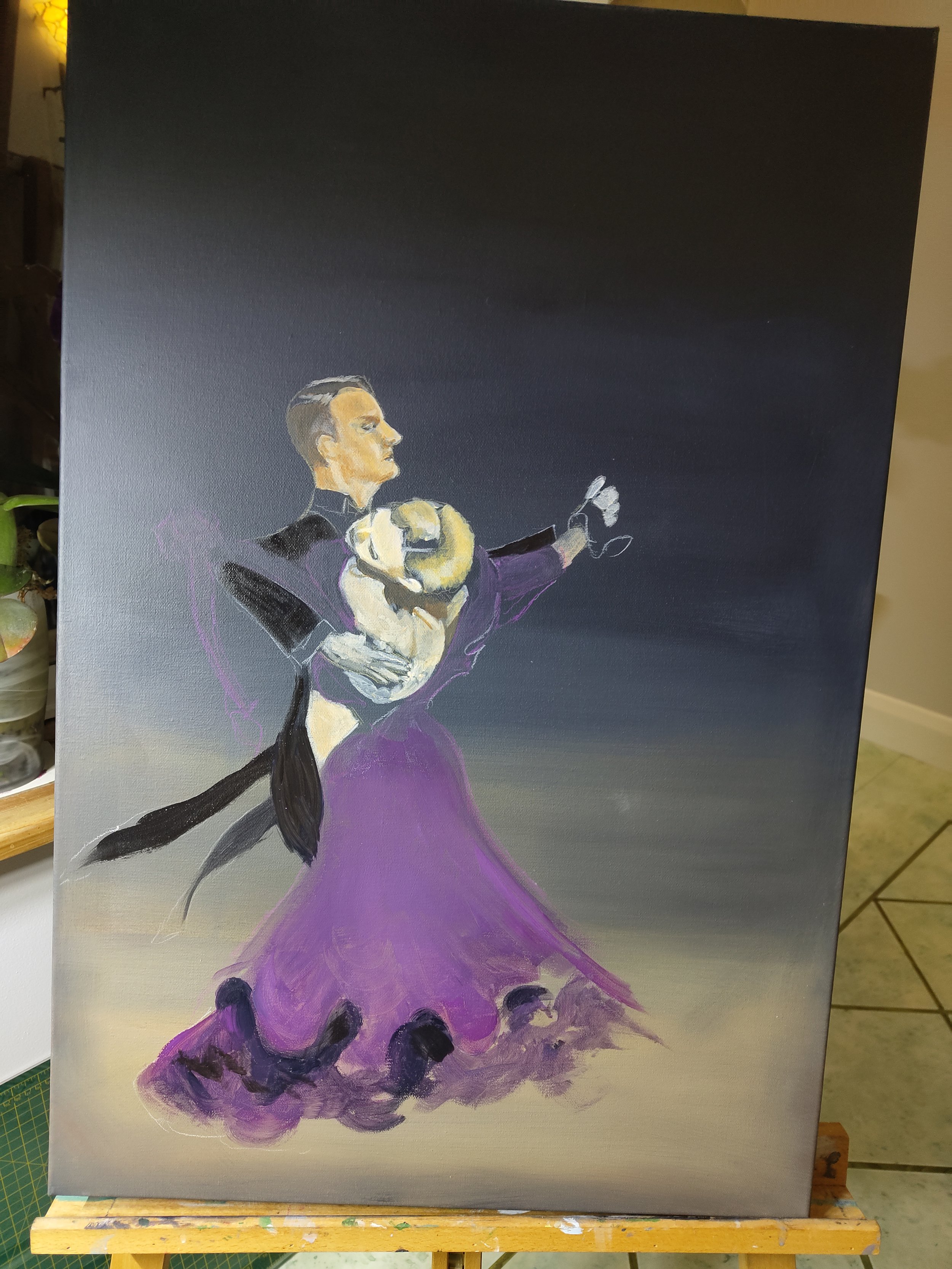
When I am not painting I love ballroom dancing with my wife. When we first got started 8 years ago our teacher, Teddie, took us to a dance competition near Gatwick - Freedom to Dance. My wife took some amazing pictures at the event and I decided to do a painting from one of them as a present for our dancing friends Jane & Trevor.
I used a standard canvas from Hobbycraft and after laying down a rough background in acrylics, I sketched the couple in using water colour pencils as these would wash off once I started painting.

Then th efun started as everything about this work was unfamiliar to me, - painting people, especially faces and hands and getting the ladies dress to flow. It was also getting dark and even with a daylight led lamp getting skin tone right was hard - I went from zombies to fake tan and all shades in between
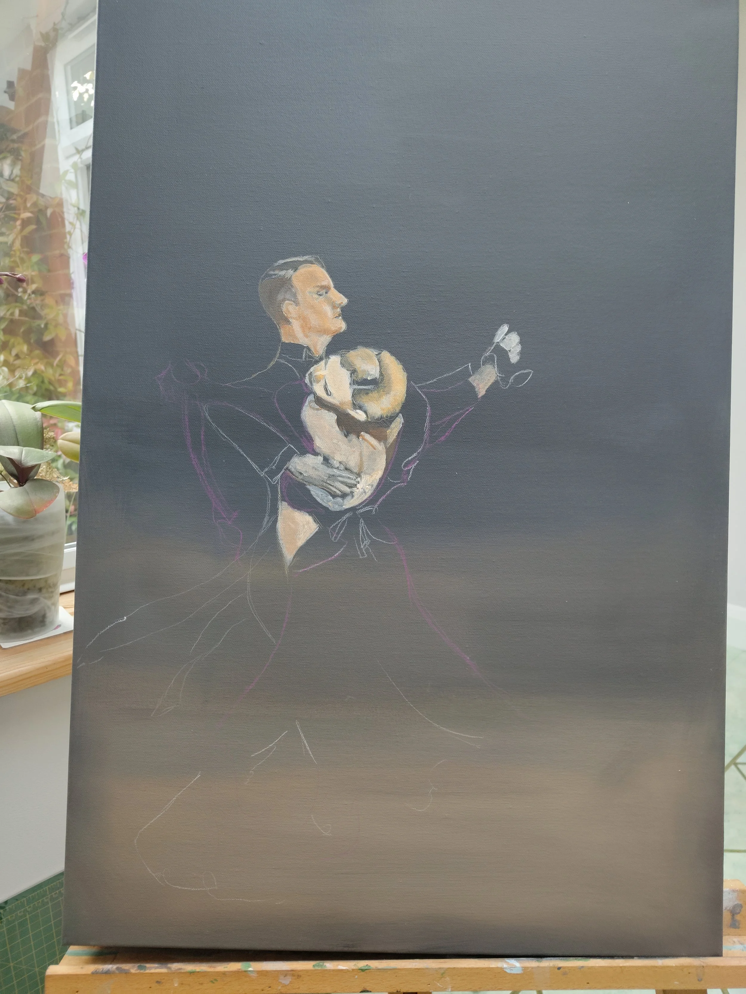
I was also working form a photo where the ladies foot was not in shot so I had to work out where it should be - after three goes I started again by getting my dance teacher to show us where her foot should be and then getting my wife pose for me in the same way.
I’d also add that in competition ladies dress are an odd, shorter length so that judges can see their feet, and to avoid getting shoes being caught etc. However I wanted to make the dress longer and more elegant and try and suggest some movement with a looser treatment of the petticoat
Job done I thought, but no I had some issues with the varnish I used and it made the background all cloudy where acrylic varnish is milky and should dry clear. So another half a day of fixing that and here is the result

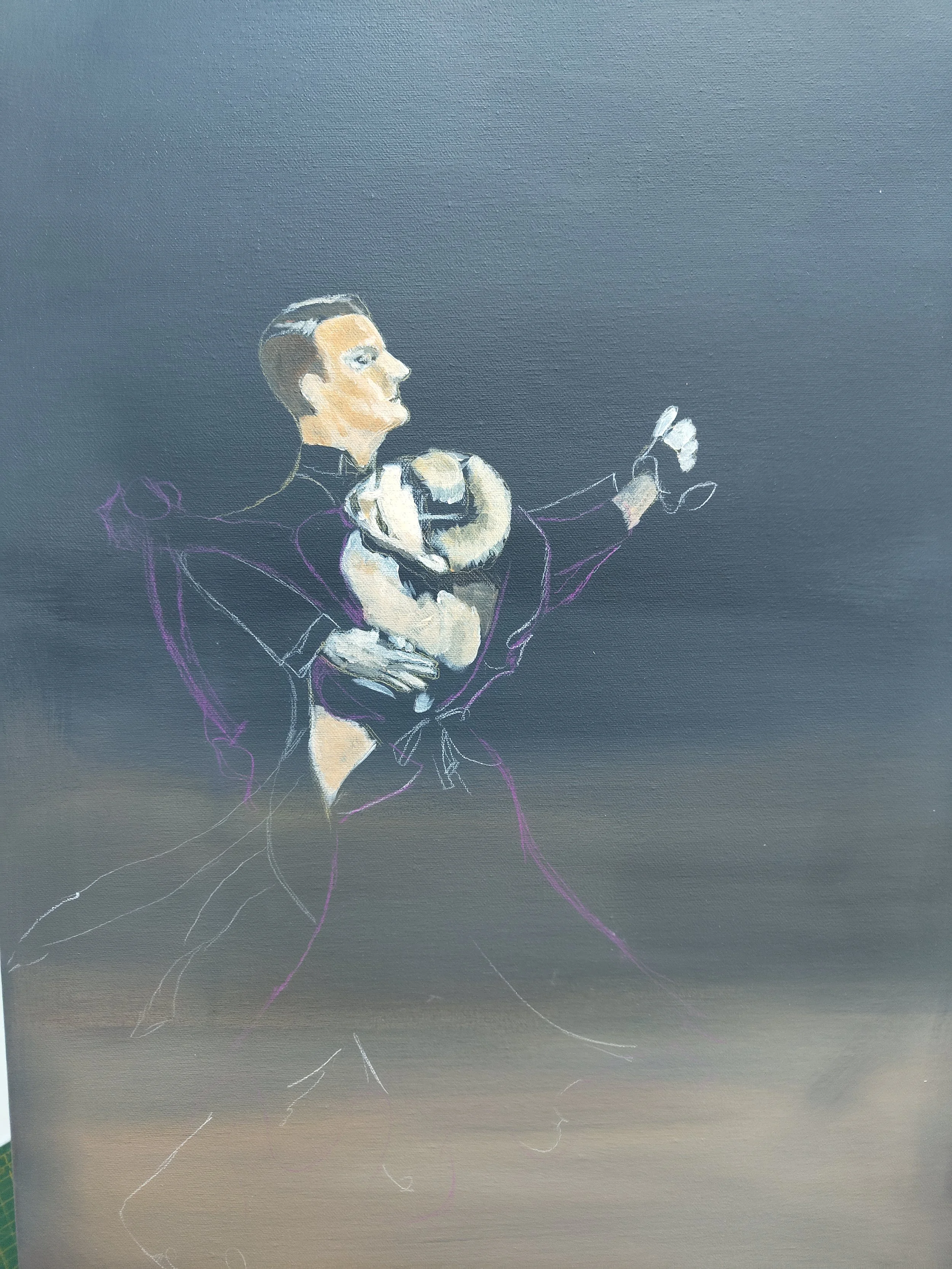
Alex Gunnarsson and Liis End sadly no longer dancing together but for me a perfect hold evocative of a more sophisticated era
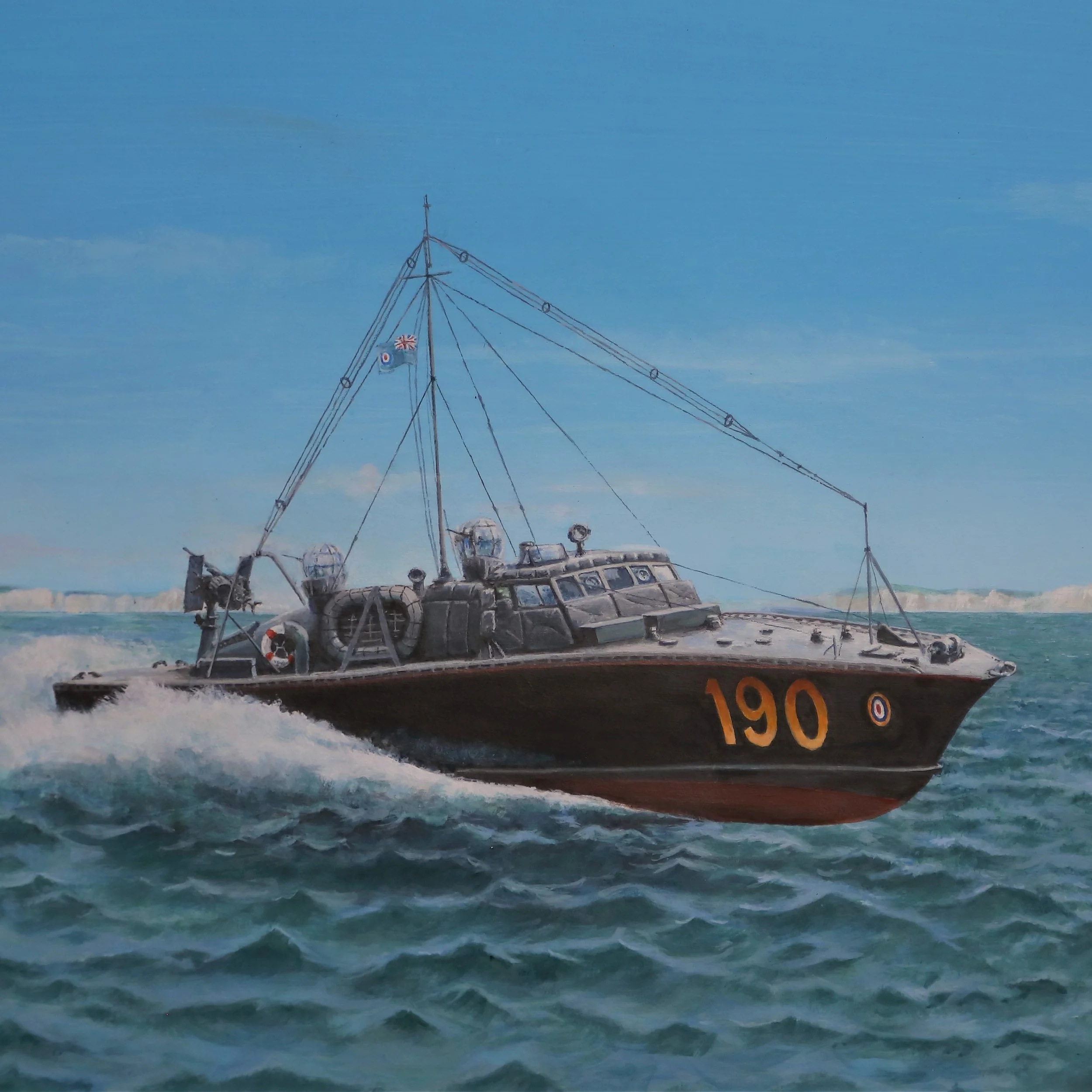
The sea shall not have them
A study of an RAF rescue launch dedicated to my old neighbour Laurie who served on this boat to rescue any downed pilots in WWII
One of my neighbours has just celebrated his 100th birthday and I wanted to paint him something special. He served on RAF rescue launches in world war two fishing downed pilots out of the English Channel. However there aren’t too many pictures to work from - there was a Pathe news film about them and Airfix honoured them by making a kit of their boats.
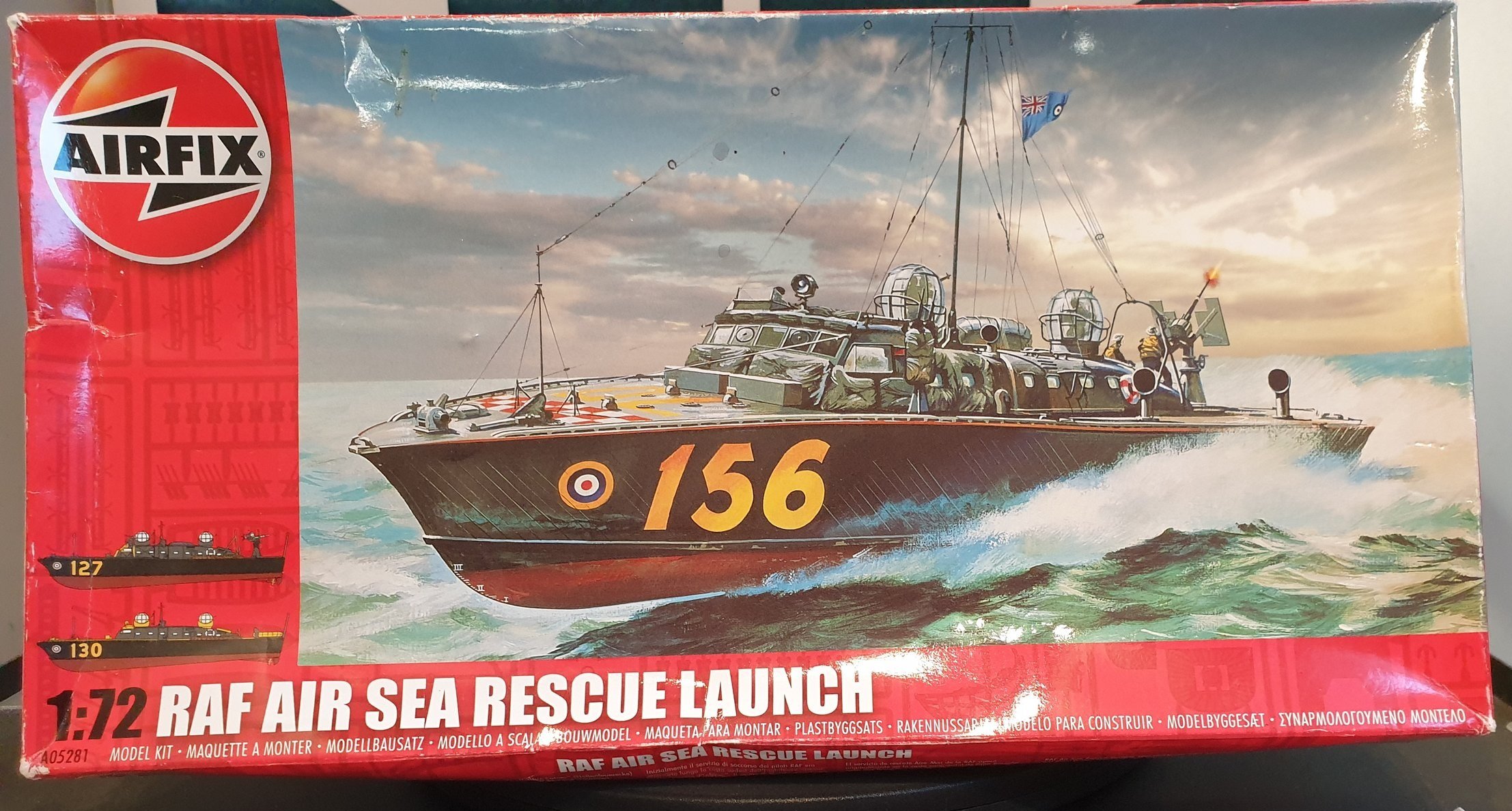
I didn’t want my painting to look like the Airfix Artwork but I did like the angle Roy Cross used as it showed more of the superstructure which helped me get the proportions right. More importantly I didn’t want my work just to be a copy I wanted it brighter more 3 dimensional and set on the Sussex coast with details for the specific launch (190) that my neighbour served on.
I started with the sky just a simple combination of two blues with a few wisp[y clouds inspired by seascapes of the channel and then added in some stylised cliffs along the coast between Brighton and Eastbourne. Getting the sea right was done with greens on the surface of the waves facing towards me with the reverse slopes in more of a blue as they would reflect the sky.

Then the trouble started. I could not get the launch to look like it was cutting through the waves properly to give an impression of the 36 knots she could do. What helped here is that my neighbour had that Airfix kit and he asked me to make this up. the shape of the hull is not obvious but seeing it in 3d really helped ..

I also found my initial attempts at the superstructure were to flat - exactly what I was trying to avoid. Also these launches changed over time with more guns and shrapnel protection being added so getting the details right was hard as well.
Finally I even had trouble finishing up because I’d used some diluted acrylic washes and these moved when applied excellent Liquitex varnish I use so note to self next time dilute with acrylic thinners :-(
However I am pretty pleased with the results of three days effort, but I don’t see me applying for a job with Airfix to do their box art!

they sea shall not have them
and now I have completed the model less rigging..

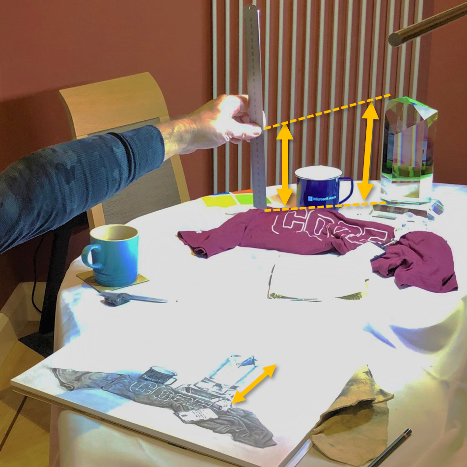
Back to Basics
Drawing from life is an essential skill when learning to be an artist. Here I am sketching some stuff I have from work just using a few pencils and and an eraser
The great thing about teaching is that you learn so much when you do do that. My friend Roy asked how do you get the proportions right in a sketch and for me the easiest way to do that is to show by example. I got some objects that I have been given at work and arranged them as a still life with a strong primary light source so I could always go back to it and work on it..

You’d be amazed at what Microsoft puts its logo on!
I chose these carefully for their texture and shape including and in case you’re wondering the a 2kg green crystal (aka Kryptonite) at the back is what we get for 10 years at Microsoft!
So how to start drawing this?
Step one is composition - I won’t go into details but these were the things I thought about in arranging this:
you don’t want the crystal exactly in the middle of the picture,
I needed another object the mug to create some height to the left of the crystal
I wanted to see the writing on the t-shirt and make it look like a t-shirt without it being to neat and artificial
The next challenge is to capture the 3d composition on 2d paper. To do this find an exact eye position to do the drawing from and note how everything looks from this position so you can return to it. In this case I moved left and right until the left hand side of the letter O is is in line with the right side of my mug and the bottom of the crystal stand is just obscured by the top of the t-shirt the angle of this photo doesn’t quite show that but you get the idea.
Then I start measuring I worked out that from where I was sitting I could simply use the same dimensions to make the study on a sheet of A3 paper - for example in this picture from my position the crystal looks 12cm against my ruler held at arms length and I can use that same measurement on my drawing. It’s essential to do these measurement from the same position each time

I draft the outline of the key shapes by measuring everything from a common point and cross check distances and angles to get a rough sketch with an HB pencil and not pressing too hard so these construction lines can be rubbed out as the work progresses.
To make this outline realistic the objects need to be filled in and my tips for shading would be:
Nearly close your eyes and look at the subject - you should be able to identify the brightest and darkest part of the the subject. This works because everything is out of focus and you can only see the most obvious patches of light and shade .
Work over each area with multiple grades of pencil. For deep shadows 9B is very dark but doesn’t fill the holes in the paper like a harder pencil so going over dark areas with a 2H makes them look darker.
Practice even shading and correct errors with a stump, putty rubber and more shading as needed
The flat surfaces of the crystal are not an even tone, typically they are darker nearer an edge and then get lighter.

note the darker shading denoting the edges of th ecrystal
Finally there is no substitute for practice, and I’d suggest if you are serious about drawing try and do a little every day.
My final sketch is below

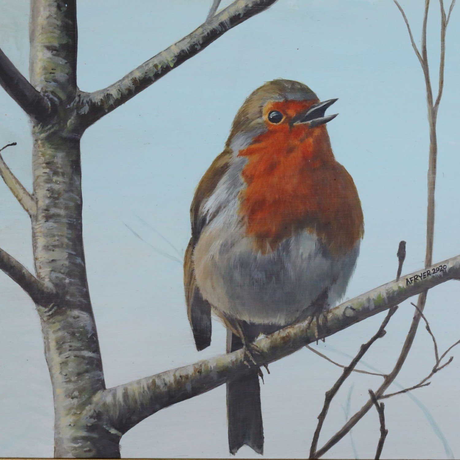
It's that time of the year
I do a christmas card design every year for family and friends. This year it’s on of our local robins one a cherry tree in our back garden
I have built up a tradition of creating a piece of my work to serve as our Christmas card and these are often treasured and kept by my family and friends. I also give the original work as a present and this year my robin is going to be gift for our dance teacher Teddie if we ever get out of lockdown. She tries really hard to get this clumsy old fool to foxtrot as well as I paint, and I know she misses her pupils as the Covid crisis only seems to deepen, so I’ll try and drop it round when I am allowed to..
I have painted a Robin before but ruined it when trying to improve the background. This version was inspired by our resident robin who delights in watching us working on the garden from the comfort of one of our apple trees. The background is just a subtle transition of blues and then I used ever darker colours to create the impression of depth with the branches. I always try and use more colour than there is and I like to work from my own images, in fact I specifically take photographs to draw from.

Safari
I wanted to brighten up my sister’s new house with some water colour pencil drawings form a recent safari in Cape Town.
I got an outstanding achievement award for my work back in 2015 which resulted in an organised weeks holiday for my wife and I to Cape Town along with 300 or so other Microsoft colleagues from across Europe and the Middle East. Part of this was a day trip to a safari park and we got some great shots:

A couple of years later my sister went to Kruger National Park and so I thought I would do a series of pictures for her to remind her of her trip as I had painted Wolf for my brother. I decided to use my normal watercolour pencils but this time on coloured paper designed for pastels, with a different natural shade for each one. The light reflected off the soil and the soil in their coats made the animals seem almost pink so I consciously used the same pencils in each drawing and only made minimal use of raw black and white to make them as colourful as possible. I am especially pleased with the Zebra and although the rhinoceros took the longest he’s the one I am still not happy with. However showing these to friends it seems everyone has their own view

The finished works are under the animals section.
Finally thanks to Rob F, the best manager I have ever had for going well beyond the day job, and giving my the opportunity to do these for my smarter sister
Wolf
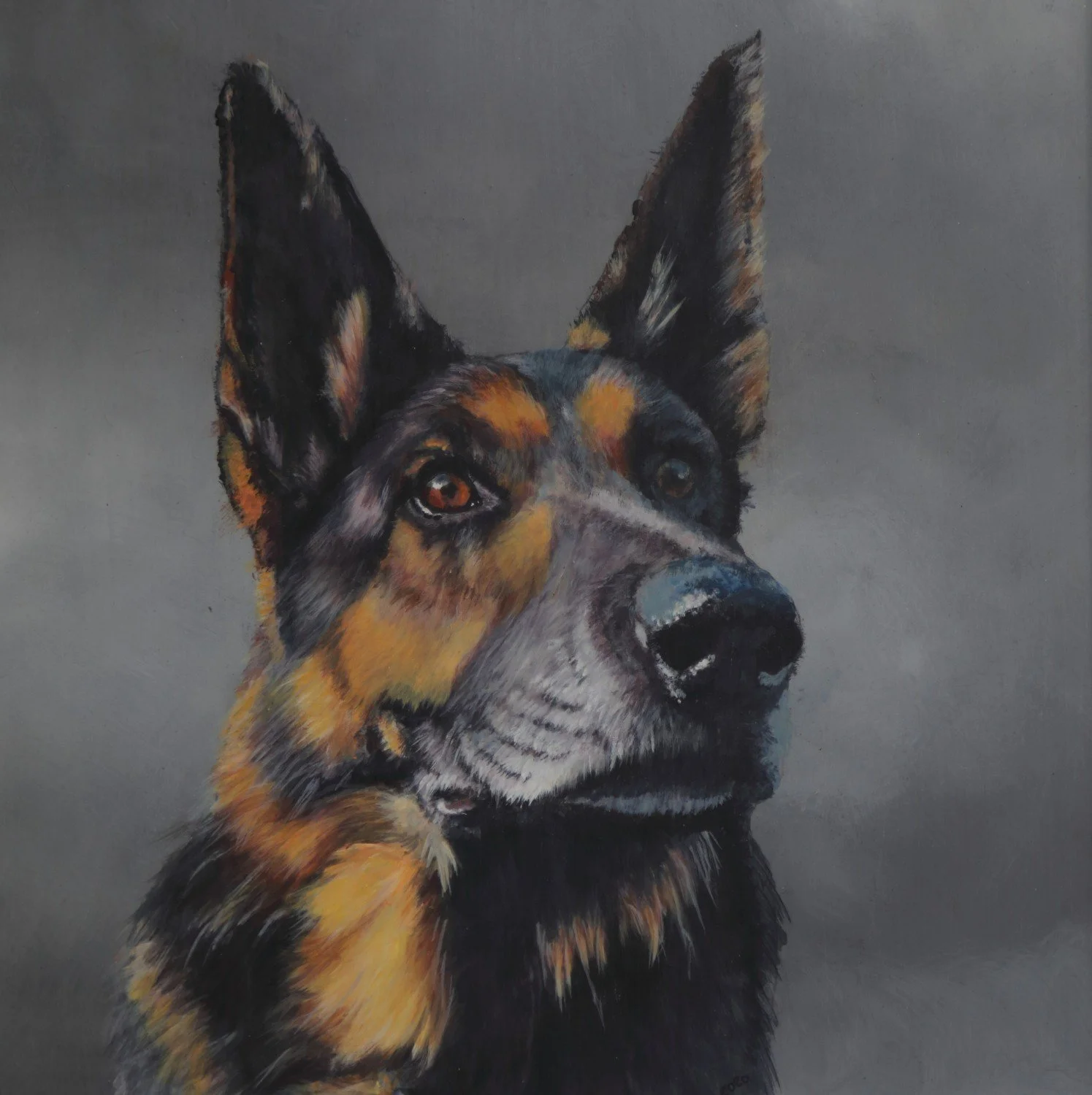
A special memorial painting, Wolf was my brother’s best dog when they served together in the police
Wolf was my brother’s favourite dog and they were both commended at the highest level for their work together in the Police. So I wanted to a really good study of this amazing dog, that really captured him. If you’ve looked at other pages on here my work tends towards detailed illustration, but for this I wanted something looser and more emotive.
Wolf is no longer here but over the years our family have taken lots of photos but in most of these his tongue is out as it’s a dogs radiator when they are warm and Chris and Wolf are always training. His family all commented on his lovely eyes so I thought a face portrait rather than all of him would be best. I had thought about a representational background but reverted to an abstract sombre greys to bring out the eyes and as a cue that he is no longer with us.
I used several techniques to create more expression in this work - Bigger brushes, not wearing my glasses all the time, and I usually had a beer on the go for each session! Like all artists I made mistakes doing this and I had to restart it from scratch after the background went wrong. As you can see below I started out picking out the main shadows with Payne’s grey and the highlights with a cream colour, both straight from the tube with a big hog brush for this

When it’s warmer there’s nothing nicer than painting outside.
I am also trying to encourage my friend Roy to paint more and we both have a socially distancing beer in my outdoor studio while I explain what I am doing. I promised Roy I’d only work on it when he was here so he could see the whole process and I think this helped me to continually revaluate my work by starting each session with a careful examination of what needed improving as I wanted to encourage him to be critical of his own work rather than me making suggestions and also to show that art is essentially learning through these mistakes.
My brother has now got a memory of his favourite dog and it has pride of place on his wall

Code Breakers
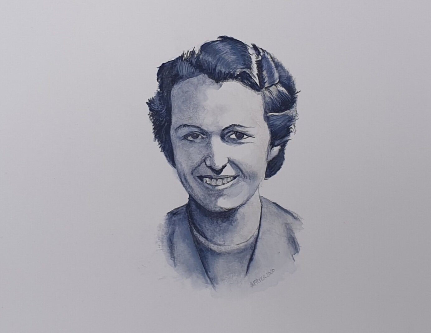
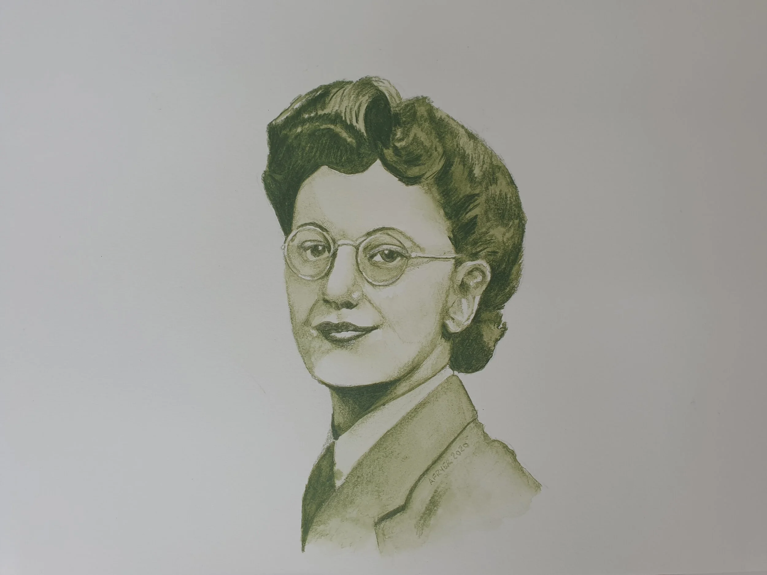
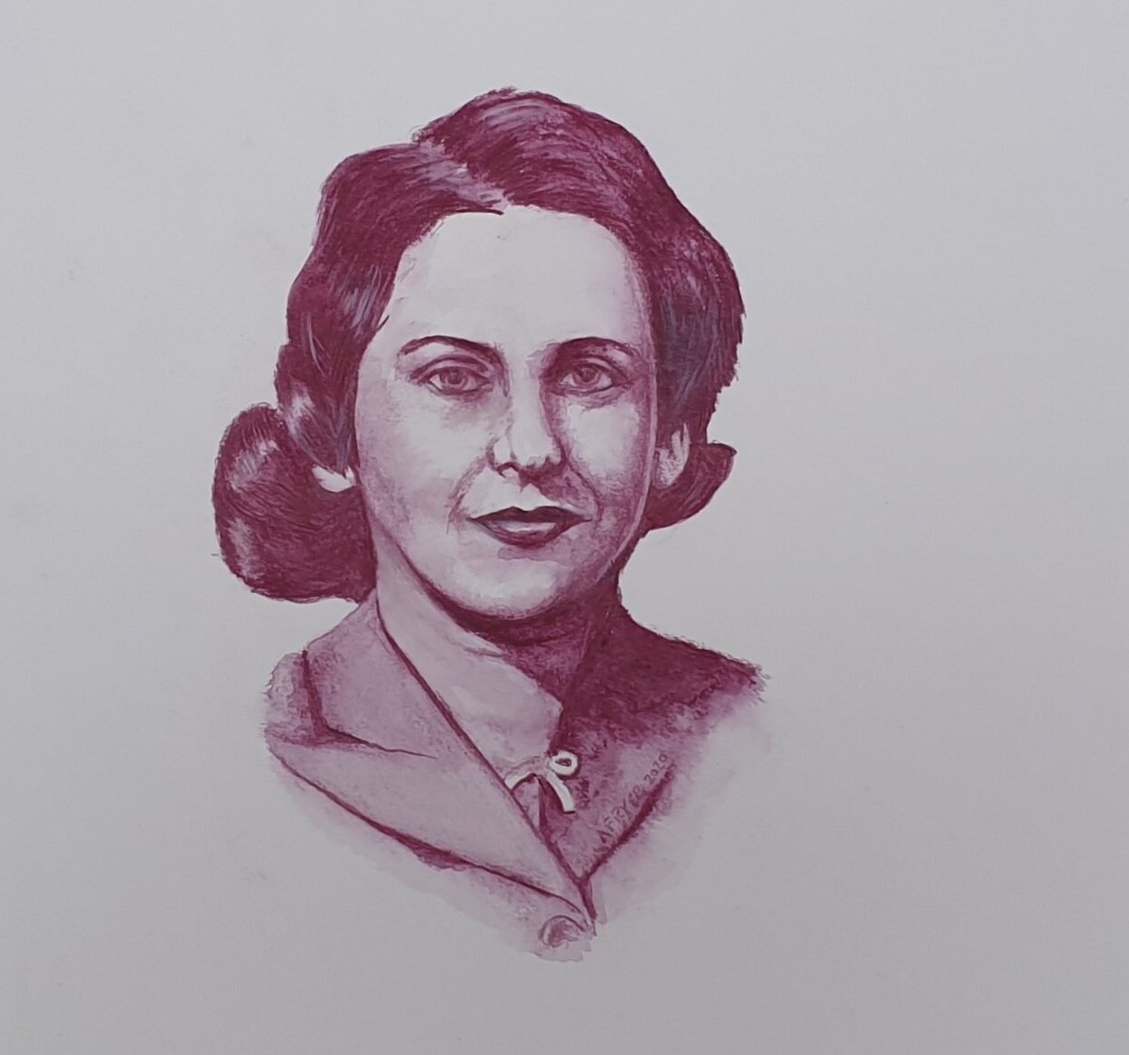
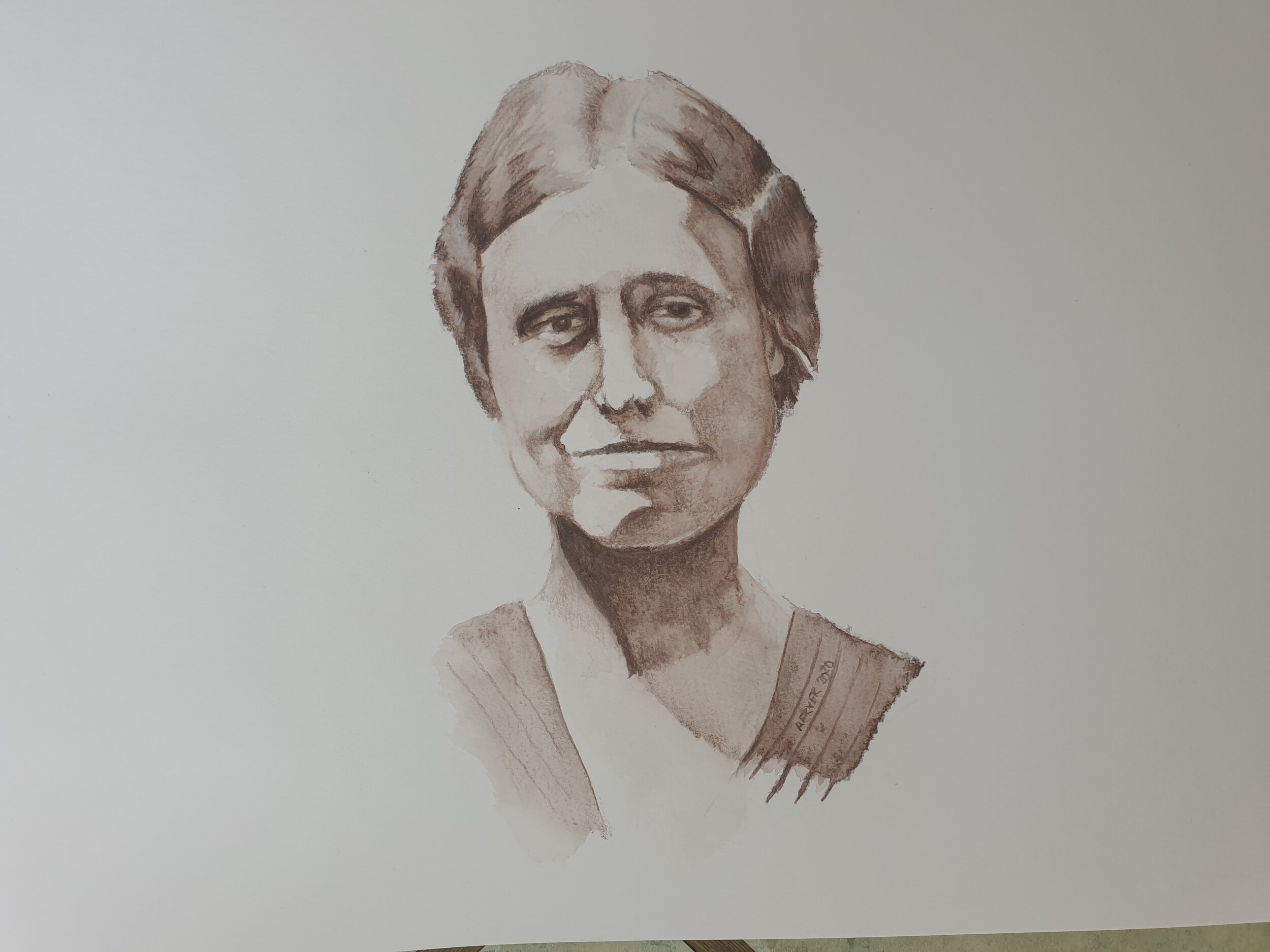
In the Microsoft engineering group I work in we have formed into for Development Crews - -Lever, Rock Briggs and Clarke. These four ladies worked at Bletchley Park and helped to crack the enigma codes in WWII.
My day job is a software engineer at Microsoft in the UK. I mention this because after our latest reorganisation we were formed into four development crews and rather than call them 1, 2, 3, 4 or A ,B ,C, D we decided to have a little internal poll on what to call them. The most popular idea has been adopted and so each crew is named after a top code breaker who worked at Bletchley Park, and who happened to be women as well.
The number of contemporary photos of these unsung heroes are very very limited and there is only so much you can do with photoshop to bring them more to life so I thought it was time to break out the pencils.
Here we have Mavis Lever (blue), Joan Clarke (green), Jean Briggs (red), and Margaret Rock (brown), These were done just using a couple of water colour pencils to recreate the duotone effect of the period when colour printing was expensive. Arranging their portraits like this is a nod to the Microsoft logo. Each took about 1-2 hours. Jean still looks a little odd to my eye, and the detail on Joan is light because the only two photos of here I could find were very very grainy whole figure shots.
Drawing from life
Every now and to practice drawing real objects - still life drawing. I set up a composition of one of my model locomotives with a scale model of a car from the same era.
I have to confess to having a model railway in my loft and I thought it might be interesting to capture one my locomotives as a drawing. I set this sill life up and photographed it in case it got distrubed.

As you can see at the bottom of the picture I then proceed to sketch the outline onto tracing paper not the actual paper I’d use for the actual drawing as I like to keep that really clean and free of mistakes. At least that was the plan as I am not the tidiest worker!
Soft pencils smudge really really easily, and being left handed I start on the right and have my lighting coming from the right as well so my hand does not cast a shadow where I am working

I am a leftie
Another thing to note above is to move the drawing around especially when working on curves to get your hand at the centre of the circle or curve you are trying to draw.
On of the many challenges in drawing man-made things is the gradual change of tone over an essentially flat areas like the sides of the locomotive. So I tried and shaded with even pressure flatten that with a tool called a stump. A stump is the white thing on the left it’s just tightly rolled paper and it can be used to smudge or apply graphite form rubbing a pencil on sandpaper. So using a stump for these even areas was the key to the even flat look you can see here. The finishing touch is to rework any unevenness with a harder (H-2H) pencil to even things out even more. On the subject of changing pencils it’s a bit like painting with numbers where I try and use the same grade of pencil for the same things like those side panels:
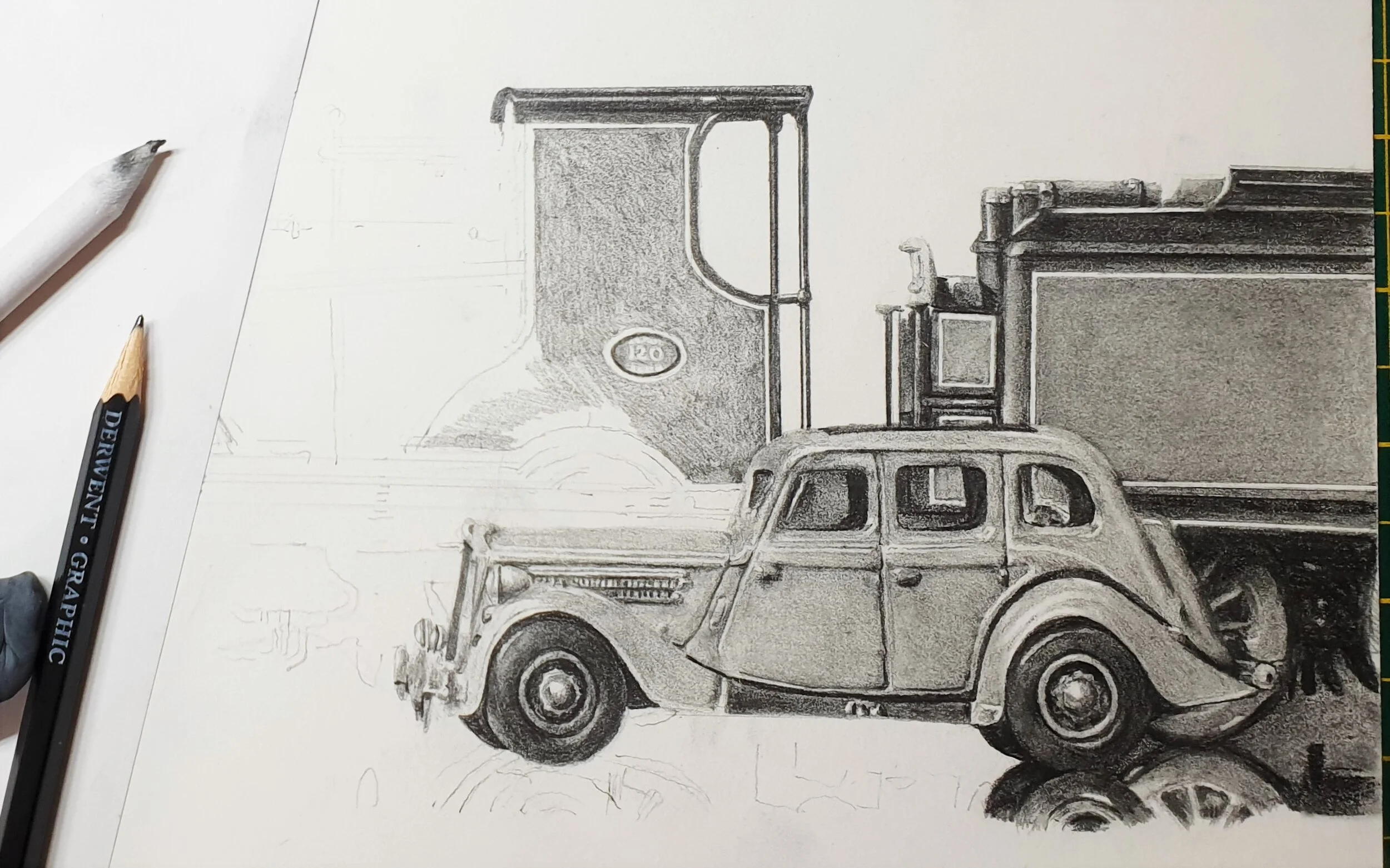
9 shades of grey pencil
Other general tips I would share are:
Keep looking at the subject, it’s very easy to get lost in your drawing
regularly stand back and look at the whole piece for overall tone and that the relative tones of highlights and shadows compare well to the original
Develop your critical eye. You need to be the hardest judge of your work to improve. techniques to help you are to hold your work up to a mirror, or take a picture of it on your phone. Both of these help you to analyse where areas need more work.
Take a break every half an hour, stretch move loosen the shoulder and get a drink. This is using your brain at nearly 100% capacity and you can get very tense with the concentration.
After 24 or so hours of work here is the finished article:

T9 greyhound done with 8-9 pencils a stump sandpaper rubber and good quality paper
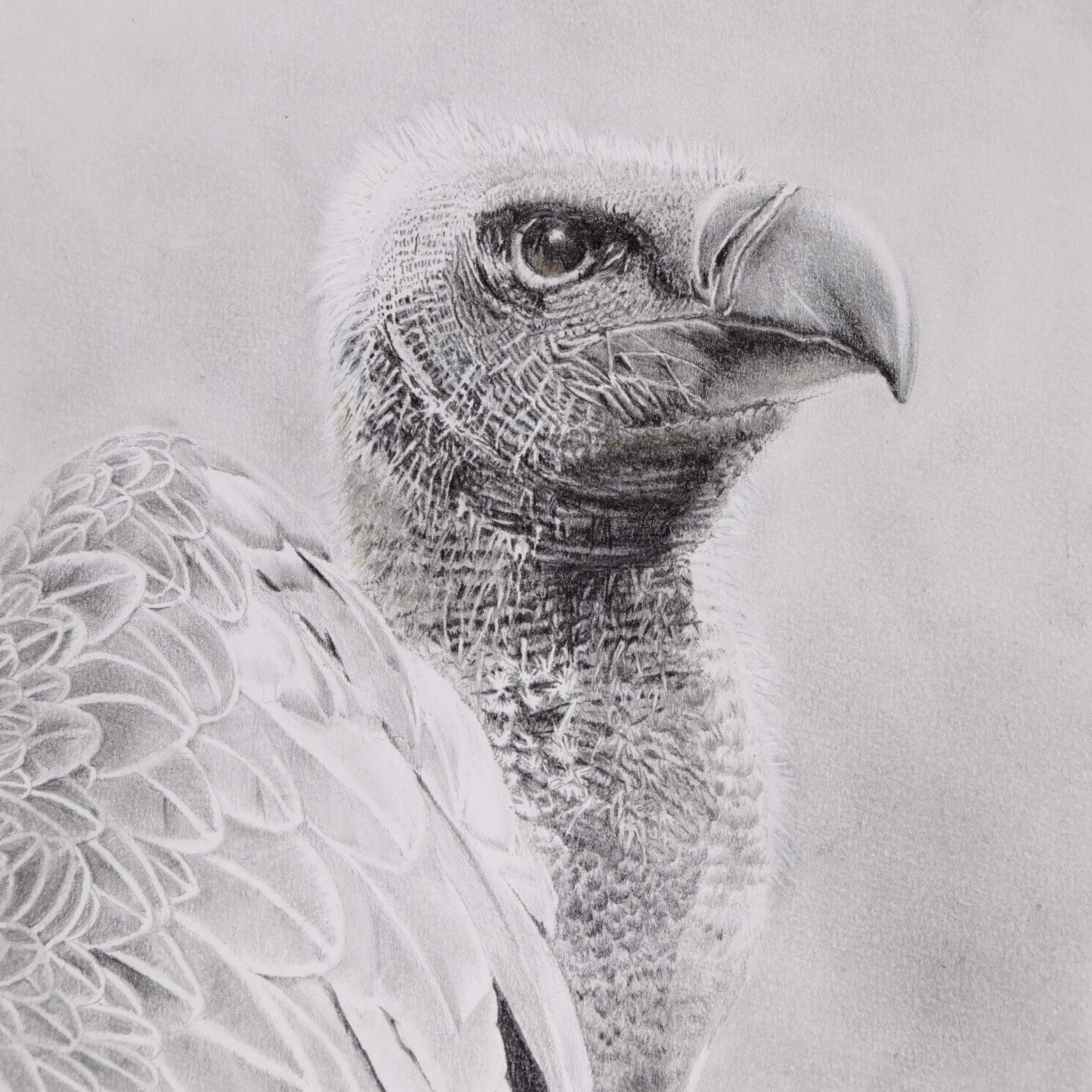
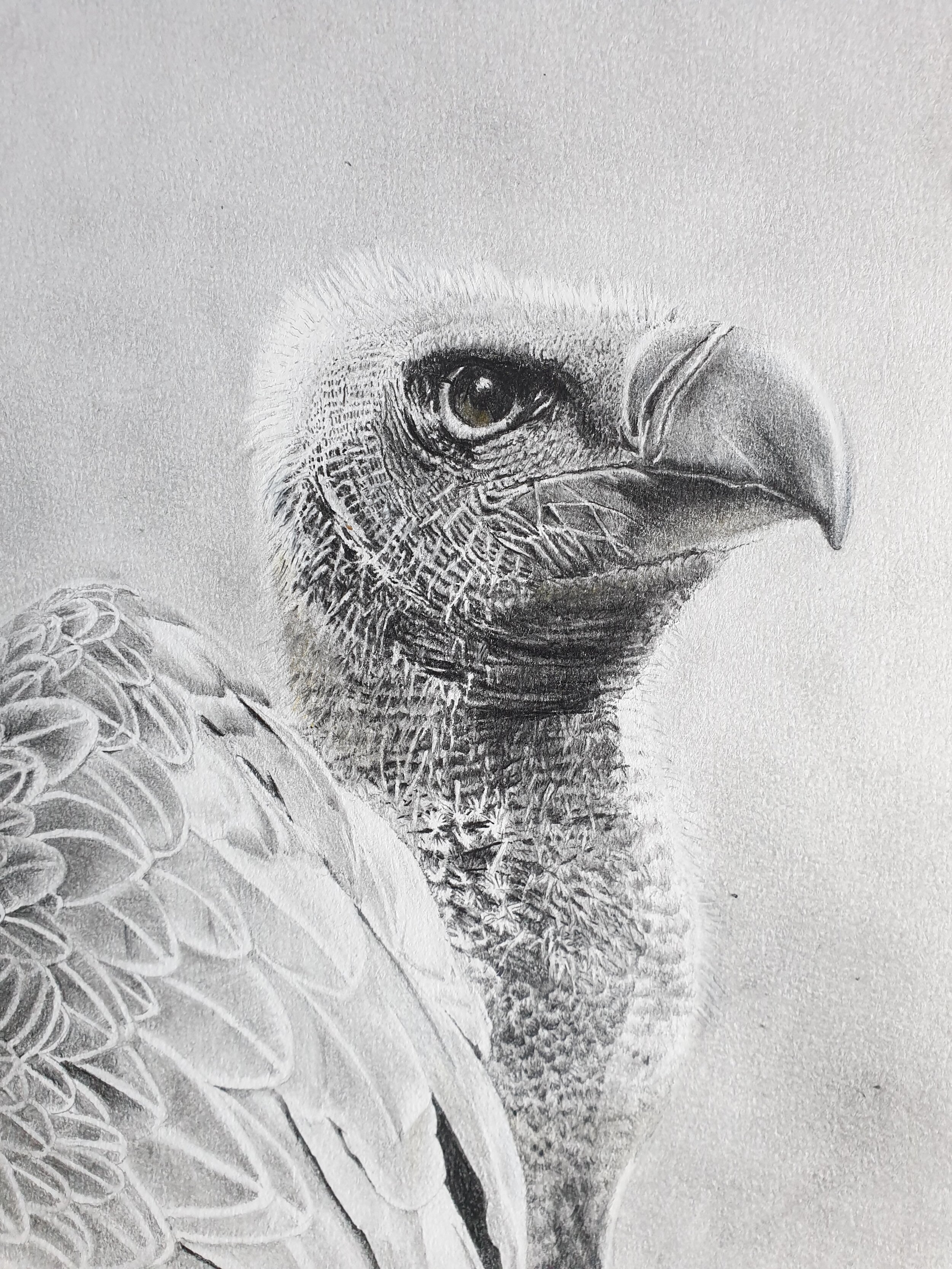
Notes on my black & white Vulture drawing
My first go at basic pencil drawing turned out well and is my wife’s favourite
I was inspired to go back to basics with simple set of pencils by work we have of NZ artist Geoff Williams like this one. I am never going to be that good but as I get towards retirement I am able to focus on my skills again like this sketch of a white vulture.
I did this from a series of picture of this magnificent bird at the Hawk Conservancy Centre in Andover.
You don’t need a big budget to draw and it isn’t that messy
Materials
Derwent Graphic pencils from H to 9B plus
a set of stumps from ebay for blending and smudging. there are simply pointed sticks of compressed high quality paper
putty rubber
a small piece of unused chamois leather
drawn on A4 Daler Rowney Fine grain Heavyweight paper
ao chnage from £25 and of course yoyu can create a lot drawing with that
Some Tips
Never touch the paper directly - always have your hand resting on a sheet of paper or even tape something to the side of your wrist & little finger as grease on paper is your enemy to achieving a crisp result. As a Leftie I started on the right of the drawing and systematically worked leftward to avoid any contact with the heavy areas of shading to keep them crisp.
I sketched out what I wanted the vulture to look like on ordinary paper only when I was happy with it did I transfer that outline to the paper I would used form my drawing via some tracing paper. a couple of things to note here.
Tracing is not necessarily cheating, many old masters would work on separate materials and create cartoons of their work and then prick through that material to create an impression on the canvas they were working from.
To get as much contrast as possible on the finished drawing you don’t want a lot of working out lines on the finished paper it’s nearly impossible to get back to pristine white paper once it has a line on it whatever eraser you use.
The details of the lines and hairs around the vulture’s face was sheer hard work. I kept my pencils really sharp and took great care to keep the highlights clean. I kept referring back to my reference material both for proportion and to get the comparative tone levels just right. For proportion an unusual trick is to look at your drawing in a mirror, step away from it and while you can work at A4 on a flat surface you need an easel for anything larger. For tone levels you can only make things darker so only go in with the big guns like a soft 9B pencil towards the end as that stuff smudges really easily and can make surrounding areas very muddy
I created the background by sanding my 9B pencil onto a clean chamois and rubbing it into the paper, and then lighting some of that with by pouncing it with the putter rubber to create a random but uniform background. When I go close to creating the background around the vulture I switched to using a clean stump and carefully work around the top of his heard to create the illusion of the light feathers against a dark background.
I hope that helps, and it’s just practice that gets results like this but the materials are cheap and the copncentration needed is good mindfulness training so please do have a go
Three pencil studies of iconic babies we saw on recent safaris